Dashboards
Dashboards allow you to create customizable views for monitoring your LLM applications. You can track project metrics like token usage, cost, and feedback scores, as well as compare experiment results across different runs.
Dashboards are currently in Beta. The feature is fully functional but may receive updates based on user feedback. We are actively working on expanding dashboard capabilities and will be adding new features in the near future.
If you have any feedback or feature requests for dashboards, please open an issue on GitHub.
Accessing dashboards
Dashboards are available in three locations within Opik:
-
Dashboards page: Access the standalone dashboards page from the sidebar navigation to create and manage all your dashboards.
-
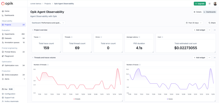
Project page: Switch to the Dashboards tab within any project to view metrics specific to that project’s traces and threads.
-
Experiment page: When comparing experiments, use the Dashboards tab to visualize feedback scores across different experiment runs.
Dashboard templates
Opik provides pre-built templates to help you get started quickly:
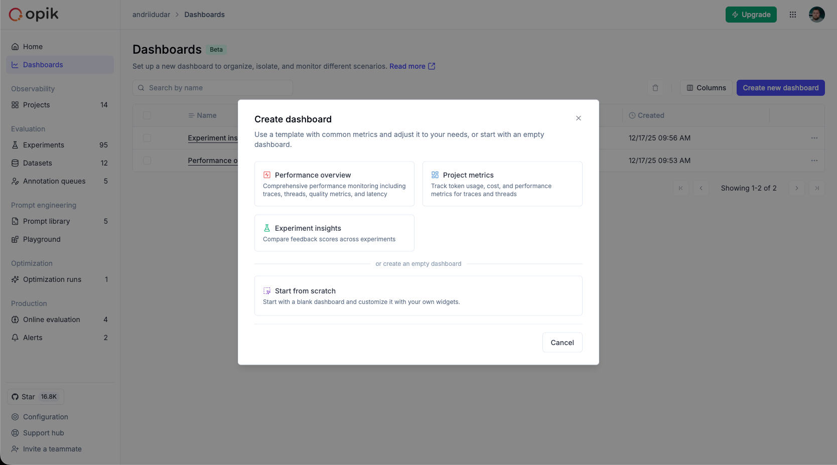
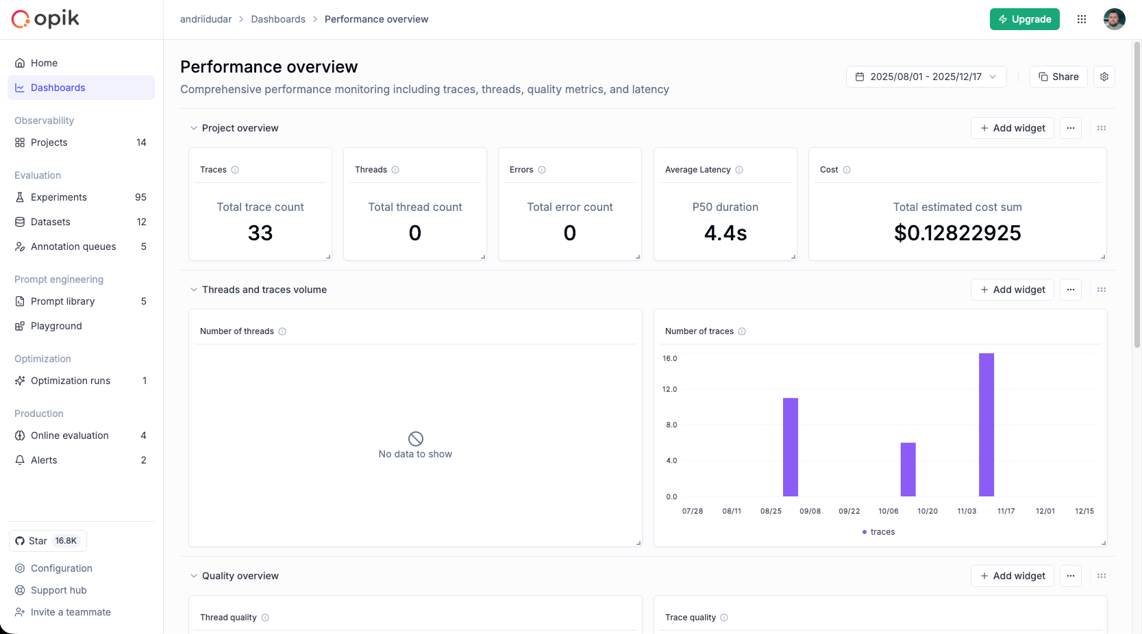
Performance overview template
A comprehensive template for monitoring project performance including:
- Traces and Threads volume: Track the number of traces and threads over time
- Quality metrics: Monitor feedback scores for both traces and threads
- Duration and Latency: Analyze trace and thread duration trends
- Summary cards: Quick overview of traces, threads, errors, latency, and cost
Project metrics template
Focused on operational metrics for your project:
- Token usage: Monitor token consumption over time
- Estimated cost: Track spending trends
- Feedback scores: View quality metrics for traces and threads
- Trace and thread counts: Monitor volume trends
- Duration metrics: Analyze performance over time
- Failed guardrails: Track guardrail violations
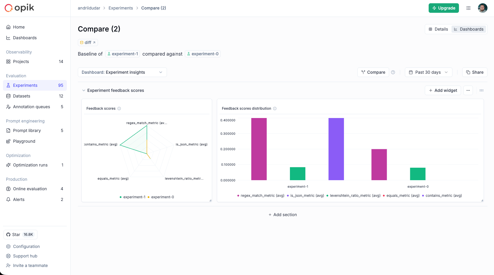
Experiment insights template
Designed for comparing experiment results:
- Feedback scores radar chart: Compare multiple metrics across experiments at a glance
- Feedback scores distribution: Detailed bar chart comparison of scores
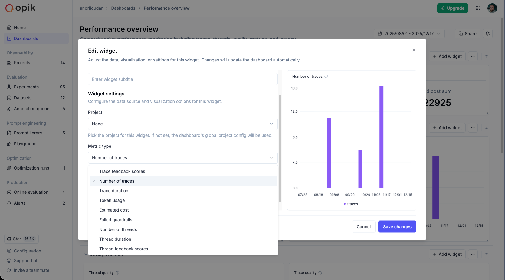
Widget types
Dashboards support several widget types that you can add to your sections:
Project metrics widget
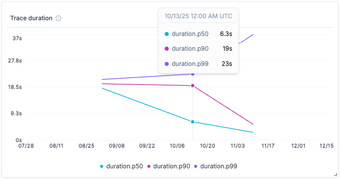
Displays time-series charts for project metrics over time. This widget visualizes how your metrics change and trend over time. Supports both line and bar chart visualizations for flexible data presentation.
Available metrics:
- Trace feedback scores - View quality metrics for traces over time
- Number of traces - Monitor trace volume trends
- Trace duration - Analyze trace performance trends
- Token usage - Monitor token consumption over time
- Estimated cost - Track spending trends
- Failed guardrails - Track guardrail violations over time
- Number of threads - Monitor thread volume trends
- Thread duration - Analyze thread performance trends
- Thread feedback scores - View quality metrics for threads over time
Configuration options:
- Project: Select a specific project or use the dashboard’s default project
- Metric type: Choose from any of the metrics listed above
- Chart type: Line chart (best for trends) or Bar chart (good for period comparisons)
- Filters: Apply trace or thread filters to focus on specific data based on tags, metadata, or other attributes
- Feedback scores: When using feedback score metrics, optionally select specific scores to display (leave empty to show all)
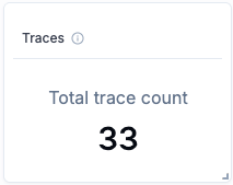
Project statistics widget
Shows a single metric value with a compact card display. Ideal for summary dashboards and key performance indicators.
Data sources: Traces or Spans
Trace-specific metrics:
- Total trace count
- Total thread count
- Average LLM span count
- Average span count
- Average estimated cost per trace
- Total guardrails failed count
Span-specific metrics:
- Total span count
- Average estimated cost per span
Shared metrics (available for both traces and spans):
- P50 duration - Median duration
- P90 duration - 90th percentile duration
- P99 duration - 99th percentile duration
- Total input count
- Total output count
- Total metadata count
- Average number of tags
- Total estimated cost sum
- Output tokens (avg.)
- Input tokens (avg.)
- Total tokens (avg.)
- Total error count
- Average feedback scores - Any feedback score defined in your project
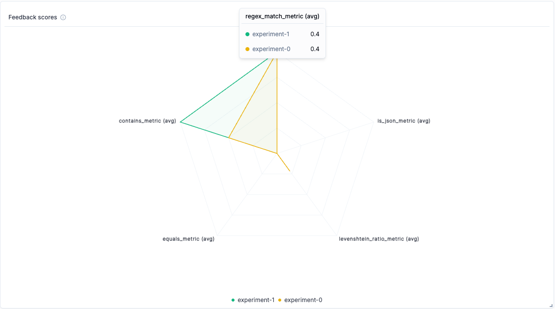
Experiments metrics widget
Compares feedback scores across multiple experiments. Ideal for visualizing A/B test results and prompt iteration outcomes. Supports multiple chart types and flexible data selection methods.
Chart types:
- Line chart - Show trends across experiments (default)
- Bar chart - View detailed score distributions side by side - ideal for precise comparisons
- Radar chart - Compare multiple feedback scores across experiments in a radial view - great for seeing overall performance patterns
Data selection methods:
-
Filter and group: Dynamically filter and aggregate experiment results. You can:
- Filter by dataset (e.g., only experiments from a specific dataset)
- Filter by configuration metadata (e.g., model=“gpt-4”, temperature=“0.7”)
- Group by dataset to compare results across different datasets
- Group by configuration keys (e.g., group by model or prompt version) to aggregate feedback scores - supports up to 5 grouping levels for hierarchical comparisons
- Best for: creating dashboards that automatically include new experiments matching your criteria
-
Select experiments: Manually select specific experiments to compare (up to 10 at a time). When creating widgets from the Experiment page (Compare experiments view), you can use this mode to visualize the experiments you’re currently comparing. Best for:
- Comparing specific experiment runs you want to highlight
- A/B testing with a fixed set of experiments
- Creating focused comparisons for presentations or reports
Configuration options:
- Data source: Choose between “Filter and group” or “Select experiments” mode
- Filters (Filter and group mode only): Filter experiments by:
- Dataset - show only experiments from a specific dataset
- Configuration - filter by metadata keys and values (e.g., model=“gpt-4”)
- Groups (Filter and group mode only): Group aggregated results by:
- Dataset - compare results across different datasets
- Configuration - group by metadata keys to aggregate feedback scores (e.g., group by model type)
- Experiments (Select experiments mode only): Manually select specific experiments from your list (limited to 10 experiments)
- Chart type: Choose line, bar, or radar chart visualization
- Metrics: Optionally display only specific feedback scores (leave empty to show all)
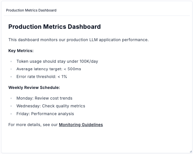
Markdown text widget
Add custom notes, descriptions, or documentation to your dashboard using markdown formatting. Use this widget to:
- Add section headers and explanations
- Document dashboard purpose and context
- Include links to related resources
- Add team notes or guidelines
Example markdown content:
Creating a dashboard
From the Dashboards page
- Navigate to the Dashboards page from the sidebar
- Click Create new dashboard
- Enter a name and optional description
- Select a template to start from, or begin with a blank dashboard
- Click Create
From the Dashboards tab
When viewing a project or comparing experiments:
- Switch to the Dashboards tab
- Use the dropdown to select an existing dashboard or create a new one
- New dashboards inherit the current project or experiment context
Customizing dashboards
Adding sections
Dashboards are organized into sections, each containing one or more widgets:
- Click Add section at the bottom of the dashboard
- Give the section a title
- Add widgets to the section
Adding widgets
- Click the + button within a section
- Select the widget type from the available options
- Configure the widget settings:
- Title and subtitle
- Metric type (for metrics widgets)
- Chart type (line, bar, or radar)
- Filters to narrow the data
- Feedback scores to display (where applicable)
- Click Save to add the widget
Editing widgets
- Click the menu icon on any widget
- Select Edit to modify the widget configuration
- Make your changes and save
Rearranging widgets
- Drag and drop: Use the drag handle on widgets to reorder them within a section
- Resize: Drag the edges of widgets to adjust their size
Collapsing sections
Click on a section title to collapse or expand it. The collapsed state is preserved across sessions.
Date range filtering
Project-based widgets respect the global date range filter:
- Use the date picker in the dashboard toolbar
- Select a preset range (Last 24 hours, Last 7 days, etc.) or choose custom dates
- Applicable widgets automatically update to show data within the selected range
Widgets that use date range filtering:
- Project metrics widget - filters time-series data to the selected range
- Project statistics widget - calculates statistics within the selected range
Widgets not affected by date range:
- Experiments metrics widget - displays experiment results regardless of date
- Markdown text widget - static content
Saving changes
Dashboards auto-detect changes. When you make modifications:
- The Save and Discard buttons appear in the toolbar
- Click Save to persist your changes
- Click Discard to revert to the last saved state
Unsaved changes will be lost if you navigate away. A confirmation dialog will appear if you try to leave with unsaved changes.
Sharing dashboards
To share your current dashboard view:
- Click the Share button in the toolbar
- The URL is copied to your clipboard
- Share this URL with team members who have access to the workspace
The shared URL includes the dashboard ID and any active filters, so recipients see the same view.
Working with templates
Using a template
Templates provide a starting point for common monitoring scenarios:
- When creating a new dashboard, select a template
- The dashboard is populated with pre-configured sections and widgets
- Customize as needed for your specific use case
Saving as a new dashboard
If you’ve customized a template and want to save it:
- Make your modifications to the template view
- Click Save as new dashboard
- Enter a name for your new dashboard
- The dashboard is saved to your workspace and can be accessed from the Dashboards page
Next steps
- Set up Online Evaluation Rules to automatically generate feedback scores for your dashboards
- Configure Alerts to get notified when metrics exceed thresholds
- Learn about Production Monitoring best practices