Outliers in data
Outliers are unusual data points that differ significantly from other values in the sample of a population. Outliers sometimes represent errors in measurement or data collection, and can have significant effects on descriptive statistics and machine learning model outcomes. There are several ways to detect outliers in our data, and here we will discuss two methods: standard deviation and box plots.
1. Standard deviation: In this method, we choose a minimum and maximum standard deviation threshold, and data points outside this limit are considered outliers.
2. Box Plots: Box plots are widely used graphical representations that make use of the 25th, 50th (median), and 75th quartiles of a data’s distribution to show a visual representation of outliers.
How To Deal With Outliers?
Once we’ve detected outliers, we handle them by removing or replacing them with some value.
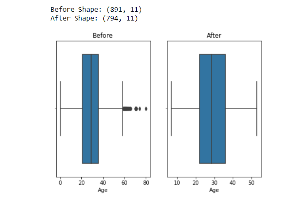
1. Dropping outliers: This is one of the simplest methods to handle outliers. Here, we remove all data points that fall outside a specified threshold or boundary. Typically, these thresholds are defined as numbers of standard deviations from the mean, but for simplicity, in the example below, we set a lower limit at 5% and an upper limit at 95% of values.
Disadvantage: The biggest disadvantage of dropping outliers is the loss of data. Especially when outliers are not due to error, they may contain some very valuable information.
import matplotlib.pyplot as plt
import seaborn as sns
import pandas as pdfig, axes = plt.subplots(1, 2)
plt.tight_layout(0.2) df = pd.read_csv('titanic_with_no_nan.csv')
print("Before Shape:", df.shape) max_val = df.Age.quantile(0.95)
min_val = df.Age.quantile(0.05) df2 = df[(df['Age'] > min_val) & (df['Age'] < max_val)]
print("After Shape:", df2.shape)sns.boxplot(df['Age'], orient='v', ax=axes[0])
axes[0].title.set_text("Before")
sns.boxplot(df2['Age'], orient='v', ax=axes[1])
axes[1].title.set_text("After")
plt.show()
2. Replacing outliers with custom percentiles: Using this method, instead of dropping values outside a particular threshold range, we replace them with minimum and maximum threshold values.
import matplotlib.pyplot as plt
import seaborn as sns
import pandas as pdfig, axes = plt.subplots(1, 2)
plt.tight_layout(0.2) df = pd.read_csv('titanic_with_no_nan.csv')
print("Before Shape:", df.shape) max_val = df.Age.quantile(0.95)
min_val = df.Age.quantile(0.05) df2 = df[(df['Age'] > min_val) & (df['Age'] < max_val)]
print("After Shape:", df2.shape)sns.boxplot(df['Age'], orient='v', ax=axes[0])
axes[0].title.set_text("Before")
sns.boxplot(df2['Age'], orient='v', ax=axes[1])
axes[1].title.set_text("After")
plt.show()
3. Replacing outliers using IQR: The Interquartile range (IQR) is a measure of statistical dispersion that divides datapoints into units, or quantiles. IQR helps measure the spread of data.
IQR primarily utilizes three quantiles: Q1, which represents the 25th quantile, Q2 which represents the 50th quantile, and Q3, which represents the 75th quantile. Additionally, Q1 is also the median of the first half of the data, Q2 is the median of the whole dataset and Q3 is the median of the second half of the data.
The interquartile range (IQR) is calculated by subtracting Q3 from Q1. One method of eliminating outliers is to place thresholds at 1.5 IQRs past the second and third quantiles in each direction.
import numpy as np
import matplotlib.pyplot as plt
import warnings
warnings.filterwarnings("ignore")
fig, axes = plt.subplots(1, 2)
plt.tight_layout(0.2)df = pd.read_csv('data/titanic_with_no_nan.csv')
print("Previous Shape With Outlier: ", df.shape)
sns.boxplot(df['Age'], orient='v', ax=axes[0])
axes[0].title.set_text("Before")Q1 = df.Age.quantile(0.25)
Q3 = df.Age.quantile(0.75)
print(Q1, Q3)IQR = Q3-Q1
print(IQR)lower_limit = Q1 - 1.5*IQR
upper_limit = Q3 + 1.5*IQR
print(lower_limit, upper_limit)df2 = df.copy()
df2['Age'] = np.where(df2['Age']>upper_limit,upper_limit,df2['Age'])
df2['Age'] = np.where(df2['Age']<lower_limit,lower_limit,df2['Age'])print("Shape After Removing Outliers:", df2.shape)
sns.boxplot(df2['Age'], orient='v', ax=axes[1])
axes[1].title.set_text("After")
plt.show()
There are other methods that make use of unsupervised machine learning to detect outliers, like Elliptic Envelope, Isolation Forest, One-class SVM, and Local Outlier Factor. You can read about all of them here.
Feature Selection
Unwanted features
Machine learning datasets are often collected with the help of web scraping or APIs, and may likely contain features we are not interested in. For example, a dataset for predicting health outcomes might contain names or other PII we’d rather not include in our project. Or maybe we’re looking to predict income, and have found a dataset that also contains information about individuals’ pets. In situations where your data contains features that are irrelevant, or potentially unethical, it is better to drop all of these columns and not include them in the model-building process. Later in the article we will also discuss how to handle features that may be correlated.
Determining which features are most relevant to a particular task is not always so straightforward as in the examples above, however. In these situations, it may be helpful to use a feature selection technique to help us identify features with less importance. These techniques often rank features based on their importance in predicting an outcome. You can then filter all the features using a threshold value for extracting the most important features.
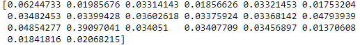
- Extra Trees model: The Extra Trees estimator fits
nnumber of decision trees to create a more generalized model with less bias. The Extra Trees estimator class has an attribute calledfeature_importancethat makes use of the Gini Index to calculate the importance of features on predicting the outcome.
from sklearn.ensemble import ExtraTreesClassifier
model=ExtraTreesClassifier()
model.fit(X,y)
print(model.feature_importances_)
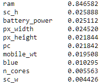
We can make this a bit more attractive, by plotting the results above with matplotlib.
from matplotlib import pyplot as plt
top_features=pd.Series(model.feature_importances_, index=X.columns)
top_features.nlargest(10).plot(kind='barh')
plt.show()

2. Mutual Information: In probability and information theory, mutual information is the measurement of mutual dependence between two variables. A measurement of 0 suggests two variables are completely independent of each other. Note this method may only be used on discrete numerical features and targets.
from sklearn.feature_selection import mutual_info_classif
mutual_info = mutual_info_classif(X,y)
mutual_data = pd.Series(mutual_info,index=X.columns)
mutual_data.sort_values(ascending=False)[:10]
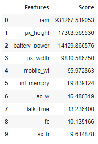
3. SelectKBest: Scikitlearn provides the SelectKBest class for selecting the best (most important) features from a given dataset using a user-defined score metric (default is ANOVA F-value). It selects K top features according to the highest score. Below, we use this method with the chi2 scoring function.
from sklearn.feature_selection import SelectKBest
from sklearn.feature_selection import chi2ordered_rank_features= SelectKBest(score_func= chi2, k= 10)
ordered_feature= ordered_rank_features.fit(X, y)dfscores= pd.DataFrame(ordered_feature.scores_, columns= ["Score"])
dfcolumns= pd.DataFrame(X.columns)features_rank= pd.concat([dfcolumns, dfscores], axis=1)
features_rank.columns= ['Features', 'Score']
top_10 = features_rank.nlargest(10, 'Score')plt.figure(figsize= (15, 8))
plt.bar(data= top_10,x= 'Features', height= 'Score')
Some other methods that provide options for feature selection include Lasso Regression, Anova Test, and more.
Innovation and academia go hand-in-hand. Listen to our own CEO Gideon Mendels chat with the Stanford MLSys Seminar Series team about the future of MLOps and give the Comet platform a try for free!
Correlation
Correlation is a statistical measure that expresses the relation between two variables. Variables can be positively or negatively correlated to each other. A positive correlation occurs when an increase in variable A leads to an increase in variable B. On the other hand, a negative correlation occurs when an increase in variable A leads to a decrease in variable B.
The range of correlation values is -1 to 1, where 1 represents completely, positively correlated features, and -1 represents completely negatively correlated features.
Having two or more highly correlated features in our training data will lead to the problem of multicollinearity, which affects model performance.
How to deal with correlated features?
The pandas DataFrame class offers the corr method, which computes the pairwise correlation of columns, excluding NaN or null values.
DataFrame.corr(method='pearson', min_periods=1)
The corr method can calculate three types correlation metrics: Pearson(default), Kendall, and spearman.
import pandas as pdimport seaborn as sns
import matplotlib.pyplot as pltdf = pd.read_csv('https://raw.githubusercontent.com/Abhayparashar31/datasets/master/titanic_with_no_nan.csv')df = df.drop(['Name','PassengerId','Cabin'],axis=1)
df = pd.get_dummies(df,columns=['Embarked','Sex'])
df.corr()
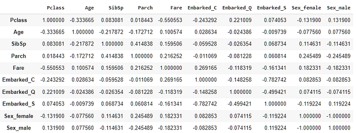
Analyzing the correlation matrix in this format can be a bit hard. Let’s visualize it using a seaborn heatmap instead:
sns.heatmap(df.corr(),annot=True,cmap='RdYlGn',linewidths=0.2)
fig=plt.gcf()
fig.set_size_inches(20,12)
plt.show()

By looking at the above heatmap, we can clearly see the highest positive correlation value is 0.41, which is between our features Parch and SibSp. On the other hand highest negative correlation value is -1 which is between the sex categories female and male (because they read as binary variables by the algorithm in this particular case).
To remove highly correlated features from our data we can set a threshold value and filter all the features that are correlated with another feature by, for example, more than 60%.
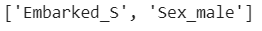
Based on our data and heatmap we should get one column between (Sex_male, Sex_female) and one column between (Embarked_S, Embarked_C):
# Threshold Value
threshold = 0.60# Empty List to Store Column Names
col_corr = []# Correlation matrix
corr_matrix = df.corr()for i in range(len(corr_matrix.columns)):
  for j in range(i):
    if abs(corr_matrix.iloc[i, j]) > threshold:
      colname = corr_matrix.columns[i]
      col_corr.append(colname)print(col_corr)
Now that we have names of highly correlated features (according to our pre-set threshold), we can simply remove them from our data frame using the drop function.
df.drop(columns=col_corr, axis=1, inplace=True)
