
Introduction
Exploratory Data Analysis (EDA) is one of the primary tasks a Data Scientist performs when starting to work on a new data set. The process informs us about the distribution or the relationship between the variables, identifies missing and unclean data, and identifies outliers. This helps in designing and upgrading data pipelines for the pre-processing of the inflowing data.
There are various Python libraries that support both statistical and scientific analysis and representation of data. This makes Python one of the most preferred languages for EDA. In this post, you will learn how to use the Seaborn library for EDA and log the charts thus generated to Comet for sharing and collaborating with the team as well as making report generation a cakewalk.
Set up Comet Project
Log on to Comet.com and click on “Sign Up” on the top right-hand side.

Add your details or sign up using a GitHub account.

Click on “+ New Project” to create a new project. This is like a directory for all your experiments.

Add project name, description, and visibility settings. The settings for this demo are shown in the screenshot below.

Clicking on “Quick Start Guide” would help you with the setup instructions and the API key.

On the “Get Started with Comet” section click on Python. This will display the terminal commands to install the Comet library on your local Python environment.
You can either choose to create a new environment or use the base environment for the installation.

Run the below command in your terminal.
pip install comet_ml
Before writing the code, add the following code at the start of your Python script (.py file)or Jupyter notebook (.ipynb file).
from comet_ml import Experimentexperiment = Experiment(
    api_key="add your api key here",
    project_name="add your project name here",
    workspace="add your workspace name here",
)
You can find the above code snipped directly from the “Getting Started with Comet” page. You can confirm if the Comet platform is listening to your experiments on the same page. Please refer to the screenshot below.

Exploratory Data Analysis
For the purpose of this demo, we’ll be using House Prices — Advanced Regression Techniques dataset from Kaggle. It’s a regression problem where the target variable is the house price and house attributes like area, structure, and amenities nearby constitute the independent variables. Therefore, we’ll analyze the relationship between independent variables and the house’s sale price. Let’s go!
Import Required Libraries
import pandas as pd
import matplotlib.pyplot as plt
import numpy as np
import seaborn as sns
Read CSV data and view the top five rows.
train = pd.read_csv('train.csv')
train.head()
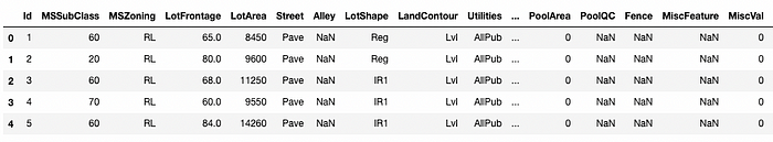
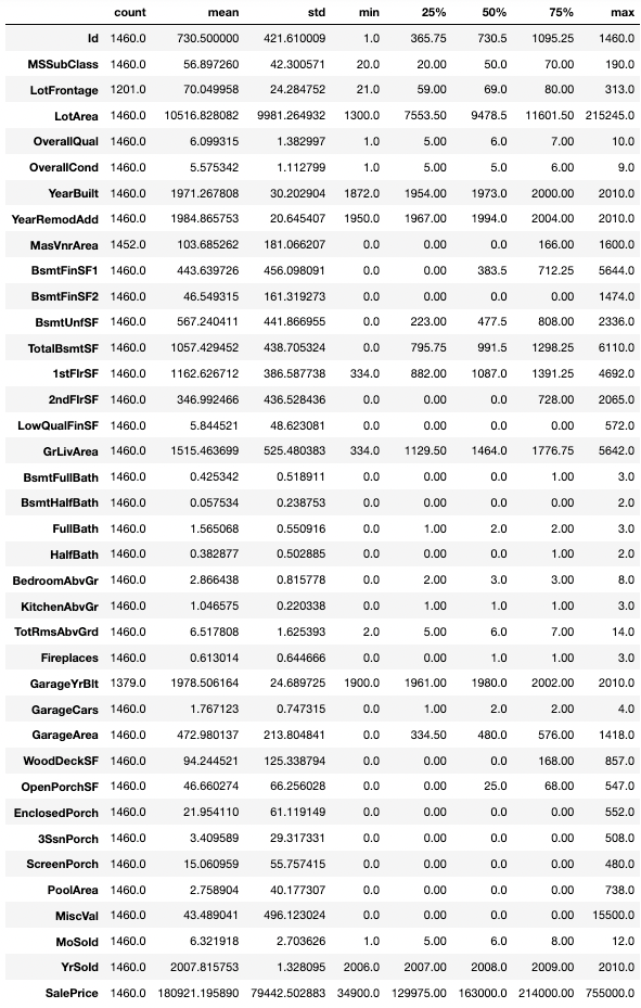
You can see a bunch of attributes relating to the zone where the house belongs or the square foot area and the approach road. Let’s get the summary statistics by:
train.describe().T
Plot Sales Price distribution
Set the figure size as per your need, then plot a distribution, and log your chart to the experiment in your Comet project using log_figure(). The distribution plot shows the distribution of Sales Prices with respect to different zones.
plt.figure(figsize=(15,10))
fig = sns.histplot(data = train, x = "SalePrice", hue="MSZoning")
experiment.log_figure(figure_name = "Sale Price Distribution", figure=fig.figure, overwrite=False)
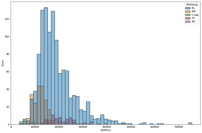
The distribution has a positive skew. You can take a log transform to correct the skew. Code for plotting and logging the unskewed distribution is as under:
train['log_sales_price'] = np.log(train['SalePrice'])
plt.figure(figsize=(15,10))
sns.histplot(train, x="log_sales_price", hue="MSZoning")
plt.show()
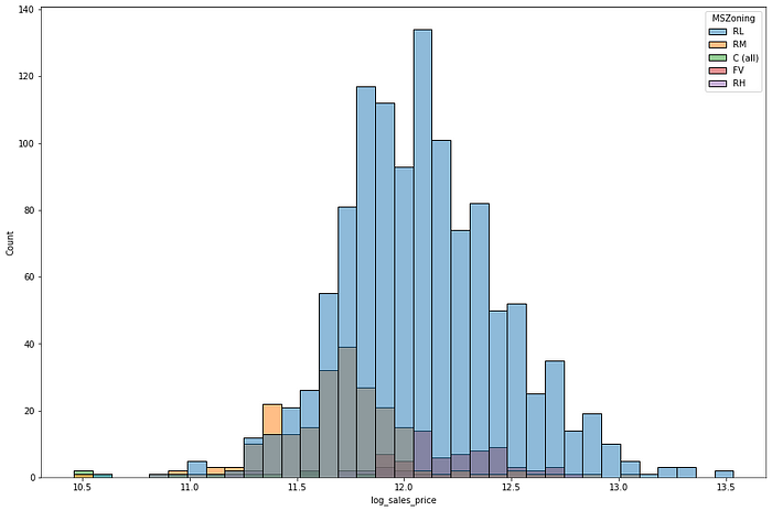
Better! Getting the numeric value of Skew and Kurtosis is as easy as below:
print("Skewness: %f" % train['SalePrice'].skew())
print("Kurtosis: %f" % train['SalePrice'].kurt())
The Skew value is 1.88 and Kurtosis is 6.54, representing a positive Skew. Similarly, we can plot Sales Price Distribution with other variables.
for i in train.columns:
    if len(train[i].value_counts()) < 5 and len(train[i].value_counts()) > 1:
        fig = sns.displot(train, x="SalePrice", kde=True, hue=i)
        plt.title('Sales Price Distribution by '+i)
        experiment.log_figure(figure_name = "Pairplot distribution and Scatterplots", figure=fig.figure, overwrite=False)
Using the above filters we get 15 charts for Sales Price Distribution. Showing below three charts for reference.
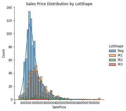
IR1 lot shape is found to be a popular choice and commands higher Sales Prices as compared to Regular lot shapes. It also has a long right tail representing a positive skew.
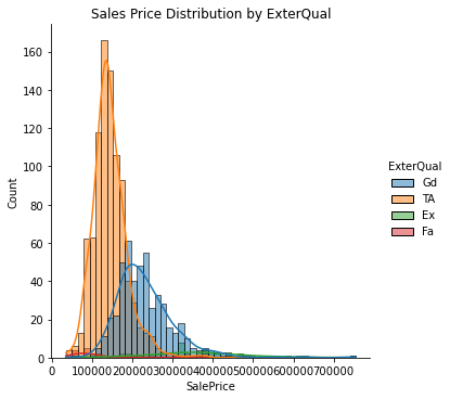
Exterior material quality also seems to be a deciding factor for house Sales Price showing a sharp difference in the distribution across its values.

Basement Full Bathrooms seems to be a weaker deciding factor for housing price.
Plot Sales Price vs. independent variables
Now let’s look at the relationship of price w.r.t. continuous variables using a scatterplot.
plt.figure(figsize=(15,10))
fig = sns.scatterplot(data=train, x='GrLivArea', y='SalePrice', hue = "MSZoning", palette="deep", style="Street")
experiment.log_figure(figure_name = "Complete Data", figure=fig.figure, overwrite=False)
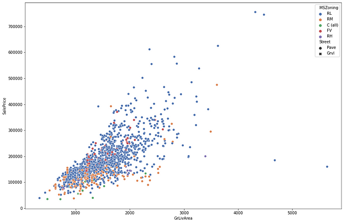
The relationship seems to be a non-linear one with Sales Prices variance increasing with an increase in GrLivArea. Let’s bring the two on a logarithmic scale and re-look at the relationship.
train['log_GrLivArea'] = np.log(train['GrLivArea'])
train['log_SalePrice'] = np.log(train['SalePrice'])
plt.figure(figsize=(15,10))
plt.title("Log transform of Sales Price vs Ground Floor Living Area")
fig = sns.scatterplot(data=train, x='log_GrLivArea', y='log_SalePrice', hue = "MSZoning", palette="deep", style="Street")
experiment.log_figure(figure_name = "Log transform of Sales Price vs Ground Floor Living Area", figure=fig.figure, overwrite=False)

Ah, much better! A candidate for Linear Regression.
Let’s hunt for the next best predictor starting with the basement area.
plt.figure(figsize=(15,10))
plt.title("Sales Price vs Basement Area")
fig = sns.scatterplot(data=train, x='TotalBsmtSF', y='SalePrice', hue = "MSZoning", palette="deep", style="Street")
experiment.log_figure(figure_name = "Sales Price vs Basement Area", figure=fig.figure, overwrite=False)

The scatterplot shows an interesting positive relationship and an outlier at the extreme right bottom. Outlier identification and treatment is an essential part of a machine learning project.
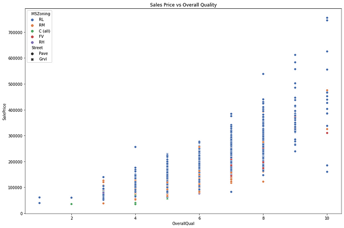
Charting Sales prices with Overall Quality shows an increasingly positive relationship. Here OverallQual is an ordinal variable thus the scatterplot looks like a queue of pillars. Please refer to the code and output below.
plt.figure(figsize=(15,10))
plt.title("Sales Price vs Overall Quality")
fig = sns.scatterplot(data=train, x='OverallQual', y='SalePrice', hue = "MSZoning", palette="deep", style="Street")
experiment.log_figure(figure_name = "Sales Price vs Overall Quality", figure=fig.figure, overwrite=False)
We can also look at the distribution of a variable using a boxplot. A boxplot is a standard way to identify quartiles and outliers. Below is a plot of Sales Prices with the Year Built.
plt.figure(figsize=(25,15))
plt.title("Sales Price vs Year Built")
fig = sns.boxplot(data=train, x='YearBuilt', y='SalePrice')
plt.xticks(rotation=75)
experiment.log_figure(figure_name = "Sales Price vs Year Built", figure=fig.figure, overwrite=False)
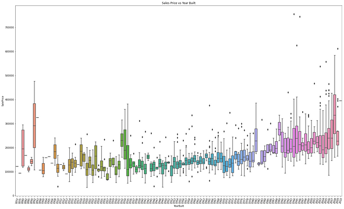
The plots show Sales prices are higher for newly built and antique houses.
Isolating difficult data samples? Comet can do that. Learn more with our PetCam scenario and discover Comet Artifacts.
Correlation Heatmaps
Numeric variables are blessed with metrics like correlation which represents whether two quantities are related (positively or negatively) or unrelated.
plt.figure(figsize=(35,20))
plt.title("Correlation Heat Map")
fig = sns.heatmap(train.corr(), annot=True)
experiment.log_figure(figure_name = "Correlation Heat Map", figure=fig.figure, overwrite=False)

A heatmap is a common way to represent correlations and uses the correlation matrix function (.corr()) from the Pandas library. The above heatmap is a bit overwhelming because of the number of variables.
Let’s narrow our search to highly correlated variables.
cols = list(train.corr().nlargest(5, 'SalePrice')['SalePrice'].index) + list(train.corr().nsmallest(5, 'SalePrice')['SalePrice'].index)
plt.figure(figsize=(15,10))
plt.title("Top 5 highly correlated variables - Correlation Heat Map")
fig = sns.heatmap(train[cols].corr(), annot=True)
experiment.log_figure(figure_name = "Top 5 highly correlated variables - Correlation Heat Map", figure=fig.figure, overwrite=False)
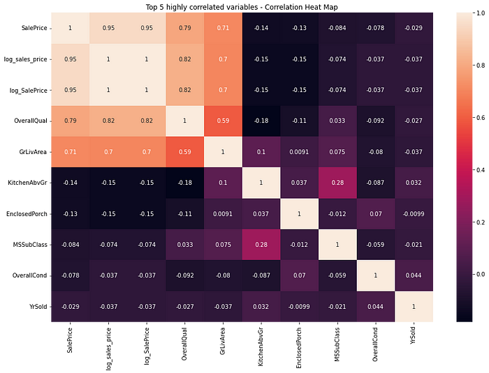
Pick the top five positively and negatively correlated variables by calling the nlargest() and nsmallest() function respectively on the correlation matrix.
Overall Quality and Ground Living Area are highly correlated to the price of the house.
Pairplots
You can also identify the relationship between independent variables in a single shot using the pair plot. The diagonal in a pair plot shows a histogram whereas the rest of the cells represent scatterplots.
cols = ['SalePrice', 'OverallQual', 'GrLivArea', 'GarageCars', 'TotalBsmtSF', 'FullBath', 'YearBuilt']
plt.figure(figsize=(15,10))
fig = sns.pairplot(train[cols])
plt.title("Pairplot distribution and Scatterplots")
experiment.log_figure(figure_name = "Pairplot distribution and Scatterplots", figure=fig.figure, overwrite=False)
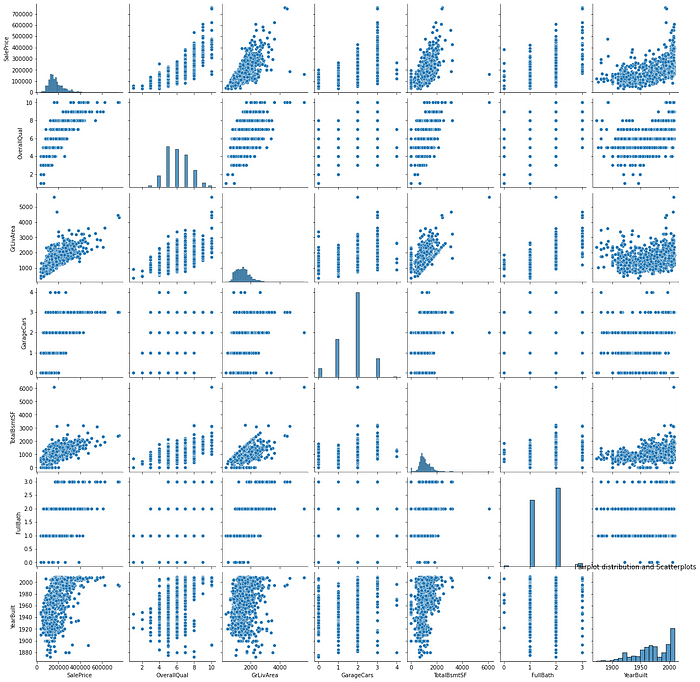
Apart from the earlier identified relationships, GrLivArea and TotalBsmtSF have a weak positive relationship and something worth investigating further during modeling.
Identifying Missing Values
It’s important to identify and treat missing values while building an ML solution. You would not want your solution to be dependent on variables with high missing values as it could lead to poor predictions in production.
total = train.isnull().sum().sort_values(ascending=False)
percent = (train.isnull().sum()/train.isnull().count()).sort_values(ascending=False)
missing_data = pd.concat([total, percent], axis=1, keys=['Total', 'Percent'])
missing_data.head(20)
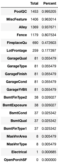
The above code identifies variables with one or more missing values and the below code removes the columns with missing values.
train = train.drop((missing_data[missing_data['Total'] >= 1]).index,1)
train.isnull().sum().max()
The output of the above code is zero, as expected.
Viewing the Logged Visualizations
Go to your Comet experiment link and click on the Graphics tab. Here you would find all your plots in one place.

Beautiful! Isn’t it?
You can use these charts and plots seamlessly across your reports.
Note: Don’t forget to call experiment.end() when using a Jupyter Notebook.
Summary
In this post, you learned the importance of Exploratory Data Analysis along with a sneak peek into using Comet to log visualizations seamlessly across projects and teams. You analyzed the housing price data in relation to various exogenous variables like area, locality, and other facilities. You learned to choose plots for univariate, bivariate, and multivariate analysis along with an introduction to the Seaborn package.
