
We ran a small model over thousands of Claude Code session and discovered how people really use coding agents.
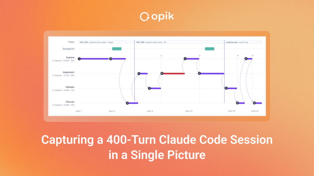
Comet Cost Intelligence is a tool for optimizing engineering token spend on Claude Code and Codex. While working on it we started with common issues: default models set too high, skills and MCP servers loaded into every session and never called. Beyond configurations and context bloat, the next cost lever is user behavior. Same model, same repo, same tools, and the cost still comes out wildly different depending on how the developer works with the agent.
In a lot of ways, user behavior is harder to optimize. If you look at a transcript or traces from coding sessions you see more data than you can possibly review, let alone find patterns. So we asked a different question: What if a session had a structure? If we could identify a smaller set of predefined blocks that exist in every session, we could show it as a shape that user can understand at a glance. It would also let us see and compare recurring patterns across multiple sessions.
Inspired by a sleep tracker
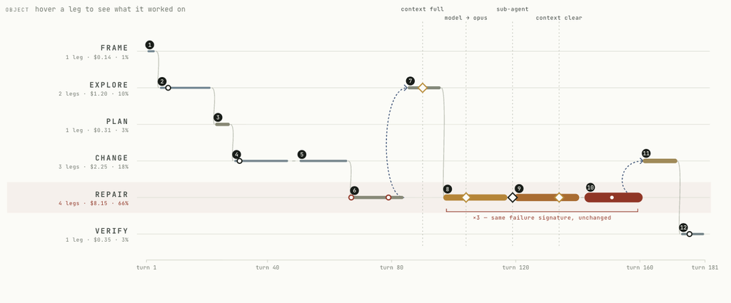
The idea came from a sleep tracker that shows you how much time you spent in different phases (deep, light, REM, awake). You understand the shape in two seconds. Could a coding session have phases like that? If it could, we could open the doors to answer a bunch of interesting questions around token cost.
For example, if a developer spends most of a session validating rather than implementing code, maybe something upstream went wrong. A coding session, opposite to sleep, has a destination. So it’s not only about phases, it’s more like a route.
That was the first concept. It was also, at that point, entirely speculative. We didn’t know whether real sessions contained a small number of phases lasting long enough to be worth drawing, or whether we could find them reliably enough to put in front of anyone.
But first we needed to actually define phases. They had to be the same on every session to be comparable. So what are the phases? We investigated some research papers on how developers use coding tools and went with the first idea that seemed workable, knowing we could change these in the future. Our goal was to keep things digestible with no more than six phases.
Based on that we prepared first as a high-level prototype and before going any further into design, we decided to build it and verify whether it worked.
Does the idea survive real data?
We were aware that even though the idea was attractive in its simplicity, there could be scenarios were it didn’t survive reality. We could declare that a session has phases and draw a nice diagram, and the sessions might still turn out not to have consistent phases at all.
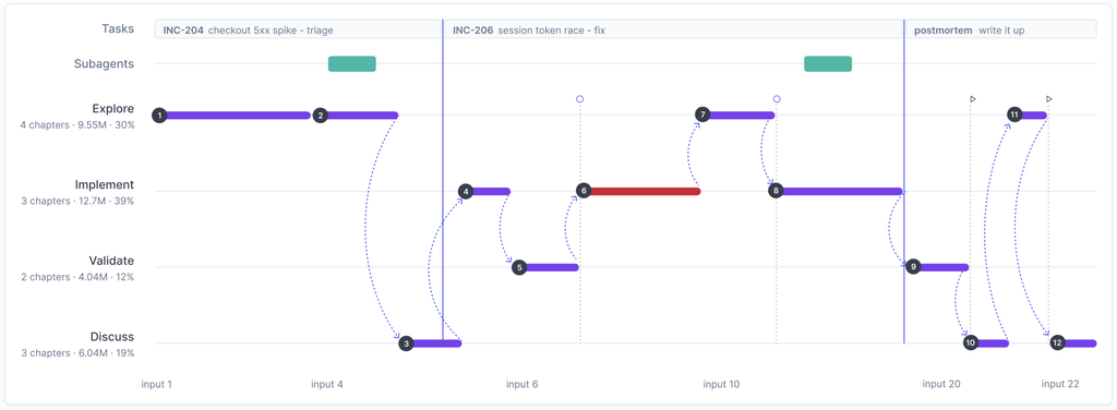
For our PoC we ran Qwen3-4B over a few thousand of our own engineering sessions. To understand how we approached it, let’s define a few concepts. A turn is one exchange: the developer asks for something, the agent works on it and comes back with an answer. A chapter is a run of consecutive turns doing one kind of thing (it’s a specific phase in time). A task is everything done in pursuit of one goal (e.g. working on one Jira ticket).
What the model gets is a stretch of numbered turns and a JSON schema to fill in: tasks and chapters, each with a start turn, an end turn, a phase and a title. Every turn falls inside exactly one chapter and every chapter falls inside exactly one task.
We were happy to learn that the structure was there. The model reliably picked out one stretch of turns as exploration and another as a fix. We checked the charts with the engineers who had run those sessions, against their own transcripts, and the boundaries matched what they experienced. The phases weren’t something we imposed on the session. They were already in it.
What a small model can actually do
Our first hope was to classify phases from metadata alone: which tools were called, in what order, how long each turn took. But the signal wasn’t strong enough. A Read followed by an Edit looks the same whether the engineer is exploring or fixing. To tell those apart you have to read what was actually said, which means putting a language model over the full transcript.
That’s a lot of data, and it’s sensitive data. So we decided to run the model locally. It’s a four-billion-parameter open model, served by vLLM on a single 24 GB GPYU in the co-located with the data, at temperature zero. Nothing goes to a provider. We did test a frontier API on the same work and it was better (more on that later) but we didn’t want to compromise on data security.
The first thing we needed to know was how much of a session the model could read in one go because it would define architecture. So we chopped real sessions into chunks, sent each one over on its own, and checked what came back. Did every turn get placed exactly once, and did the result look right to someone who had been in that session?
With twenty turns at a time, nine chunks out of twelve came back good. With a hundred turns, from the very same sessions, none of four did.
But the failures weren’t what we expected. The answers were always well-formed. We constrained the output format, so the model couldn’t hand back something broken. The trouble was underneath. Chapters that overlapped instead of lining up end to end. As an effect turn 61 belonged to two chapters at once. We also saw calls that came back empty. And our favorite, the one we started referring to as “shattering”: 57 chapters for a 57-turn window. One chapter per turn. The model had given up on grouping anything and was just handing the turns back to us.
Then we tried the same with Haiku over the same turns, and it got all of them right. That was our eureka moment, because it split problem into two. Looking at a stretch of work and saying “this is debugging” is judgement, and the small model does it well. Remembering which of a hundred turns you have already used up is bookkeeping, and the small model struggles with that. The good news is that you don’t actually need a model for bookkeeping.
The stitching problem
So the model never sees a hundred turns. We pack sessions into windows that fit a token budget (turns vary a lot in size, so a window holds however many fit) and each window is one call. What the model reads is a compressed version of each turn: the start and end of the prompt, the first lines of the response, tool calls collapsed to counts. This brings up the next challenge: how do two windows join?
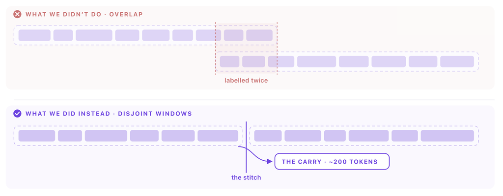
The first instinct could be to overlap them. But the overlap means two windows label the same turns, and when they disagree someone has to pick a winner. Instead the windows sit side by side, and we add a small note that crosses the stitch. The note informs about the task and chapter still open, with their names, phases and start turns (which by the way costs significantly less than using overlap). Then we use the rules to do the joining, not the model. A task continues only if the next window opens with the same task at the adjacent turn. A chapter continues only if the phase matches and no new task has begun. When two halves merge, the later summary wins but the earlier title survives — the later window watched the work finish, the earlier one named it while it still was what it was.
Every answer gets checked before it’s accepted. If we get a gap or an overlap it goes straight back to the model, which fixes it about 40% of the time. In production the pipeline fails on under 1% of sessions, and the failure is always the same one: a window the model won’t divide cleanly, even after we ask again. That’s the tradeoff we’ve accepted.
There’s one thing to add about trust. These charts are only useful if they stay put. Change a single word of the instructions we give the model and the answers shift — different boundaries, different names for the same stretch of work. So we pin all of it: the model, the instructions, the exact wording of the question. Every result is stored with the version that produced it, and changing anything means a new version and a re-run of the old sessions. A chart you looked at in March still means the same thing in September.
2,000 developers on one GPU
The session a developer cares about is usually the one they’re still working in, and it keeps growing while they work in it. So analysis runs continuously, and it picks up where it left off instead of starting over: the last stored task and chapter get read back as the note that would have crossed a stitch, and only the new turns are packed.
That’s what makes the numbers work. In our best measured hour the card handled 819 sessions — 11,933 turns — running four in parallel and busy the whole time, running four in parallel the whole hour, so that’s a rate it held, not a lucky burst. Held around the clock, it’s about 15,000 sessions a day.
An active developer in our data starts around 7 sessions on a working day. 15,000 a day is therefore something like 2,000 developers, on one GPU — call it 1,700 if you size for the business-hours peak, since the work arrives when people are awake. Our own engineering team uses a low single-digit percentage of it.
Build first, then design
The usual process is design, then build. This time we couldn’t work that way.
Before designing a nice UI and interactions, we needed a proof of concept testing whether the phase idea survived contact with real sessions at all. The concept had to be validated before we spent time on user experience. The alternative was a beautiful interface for a structure that didn’t exist.
Even after the PoC, we didn’t know what the shapes would look like on real data. So we ran it on our own Claude Code sessions and designed against what came back: build the components we were fairly sure we’d need, leave the rest of the spec open, close it once we could see actual sessions on screen.
Two things are worth highlighting. The concept got shaped by both of us as we went, rather than handed from one to the other. And we each ended up working inside the other’s discipline. Initial design happened in coding tool, so what engineering received was a prototype, not a mockup. Engineering made UX calls, because the scope wasn’t fully specified and waiting for it to be ready would have been slower than just deciding and seeing if it works. Neither role goes away in that arrangement. But you only move fast if you stop guarding the border.
What we still don’t know
Nothing tells us that a stretch labelled “validating” really means validating for the user. There’s no ground truth for a subjective label, and no clean way to build one. We can show that the boundaries are consistent, and that the same session always gives the same answer. But consistency isn’t correctness.
Coding agents talk to themselves more than you’d expect. Some of what we count as a developer’s turn is really the agent prompting itself, and we can’t yet tell the two apart reliably.
Finally, we don’t know whether the shape means anything to someone who didn’t build it. We read these charts fluently, but we’ve been staring at them for weeks, so that proves nothing. The test we owe ourselves is to show users the shape of a session they weren’t in, without the transcript, and ask what happened.
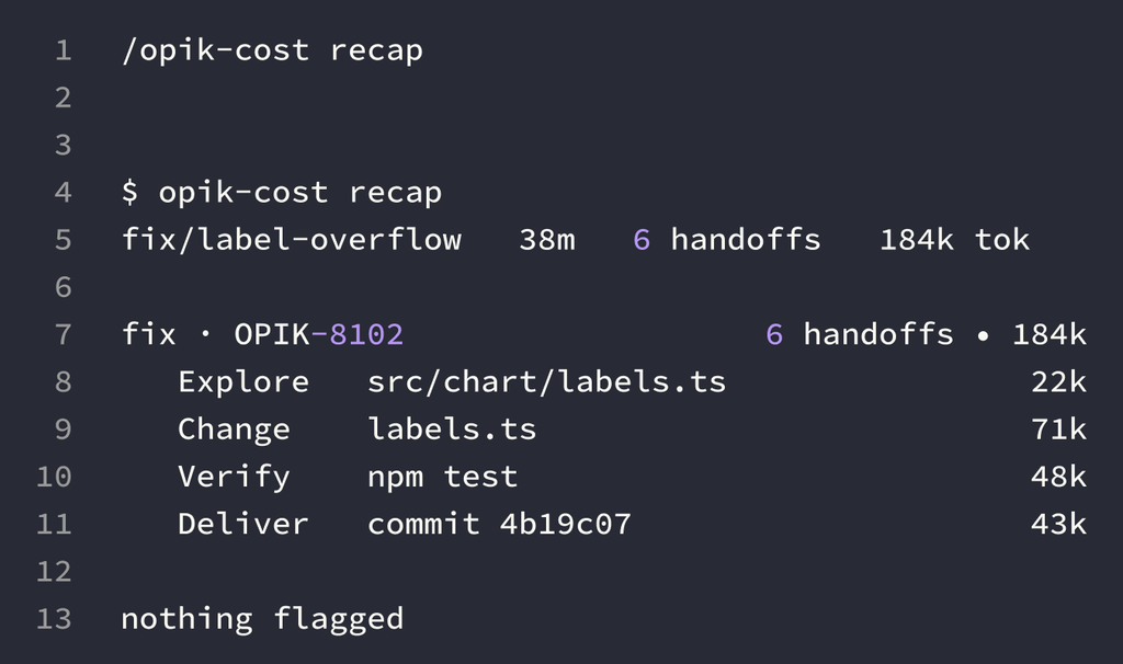
All three come down to the same thing. A chart like this is worth exactly as much as you trust it.