
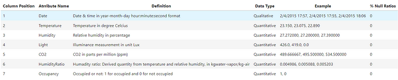
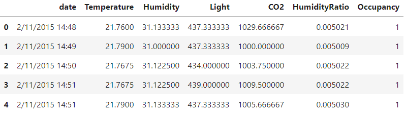
This project aims to predict whether a room is occupied based on the data collected from the sensors. The data set is collected from the UCI Machine Learning Repository. The data set contains 7 attributes: date, temperature, humidity, light, CO2, humidity ratio, and occupancy. The data set is divided into 2 data sets for training and testing. It provides experimental data for binary classification (room occupancy of an office room) from Temperature, Humidity, Light, and CO2. Ground-truth occupancy was obtained from time-stamped pictures that were taken every minute.
Data Dictionary
Importing the required libraries
import numpy as np
import pandas as pd
import matplotlib.pyplot as plt
import seaborn as sns
Loading two datasets and combining them into one dataset
#loading the datasets
df1 = pd.read_csv('datatest.csv')
df2 = pd.read_csv('datatraining.csv')
Combining the datasets
df = pd.concat([df1,df2])
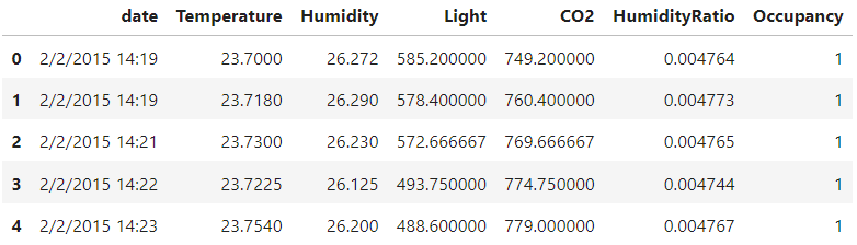
df.head()
Data Preprocessing
Checking the number of rows and columns in the dataset
#number of rows and columns
df.shape
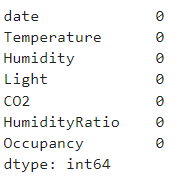
Checking for null/missing values
df.isnull().sum()
Checking for duplicate values
df.duplicated().sum()
=> 27
The dataset has 27 duplicate values. I will drop these duplicate values.
#removing the duplicate values
df.drop_duplicates(inplace=True)
Checking the data types of each column
#checking data types
df.dtypes
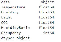
Since the column date has an object datatype, I am converting it to the datetime datatype.
#converting the date and time to datetime format
df['date'] = pd.to_datetime(df['date'])
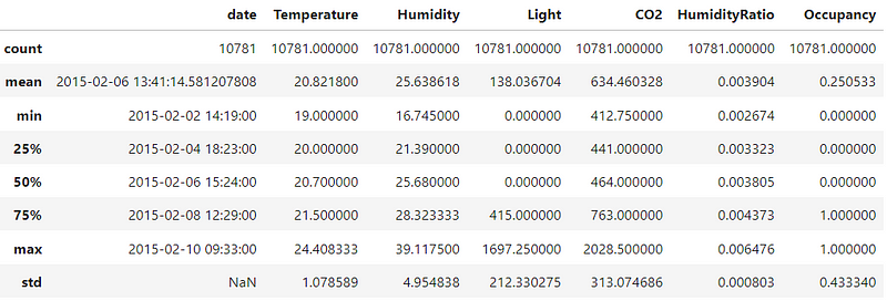
Descriptive Statistics
#checking the descriptive statistics
df.describe()
Exploratory Data Analysis
In the exploratory data analysis, we will be looking at the distribution of the data, along with the time series of the data. We will also be looking at the correlation between the variables.
Visualizing the Temperature Fluctuations Over Time
#lineplot for temperature changes for time
plt.figure(figsize=(20,10))
sns.lineplot(x='date',y='Temperature',data=df)
plt.show()
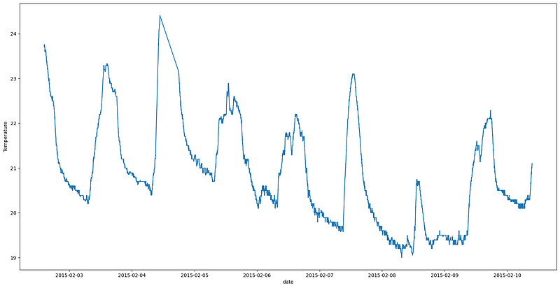
The spikes in the graph indicate that the room temperature increases suddenly, which might be due to the presence of people in the room. The room’s temperature may increase due to the heat emitted by the human body.
Visualizing the Humidity Fluctuations Over Time
#lineplot for humidity changes for time
plt.figure(figsize=(20,10))
sns.lineplot(x='date',y='Humidity',data=df)
plt.show()
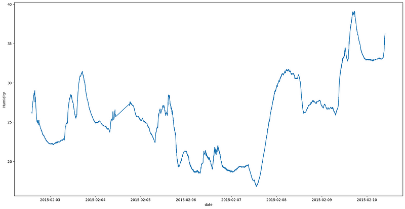
The line graph between the 3rd and 6th of February is similar to the temperature graph, possibly due to the presence of people in the room. However, from the 7th of February onwards, there has been a significant rise in the humidity levels, which might be due to the cleaning of the room or a change in the weather conditions. Room cleaning, such as sweeping the floor, might be the reason for the sudden rise in the humidity levels. But it couldn’t explain the increase in the humidity levels near the 10th of February.
Visualizing the Light Fluctuations Over Time
#lineplot for light changes for time
plt.figure(figsize=(20,10))
sns.lineplot(x='date',y='Light',data=df)
plt.show()
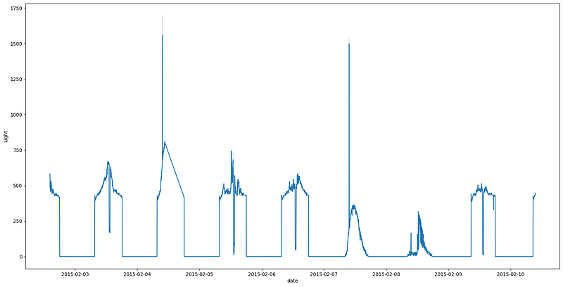
Looking closely, we can see that the number of peaks in this graph and the temperature graph are the same. This indicates that the lights were turned on when a person was in the room. This is a good indicator of the occupancy of the room.
Visualizing the CO2 Fluctuations Over Time
#lineplot for co2 changes for time
plt.figure(figsize=(20,10))
sns.lineplot(x='date',y='CO2',data=df)
plt.show()
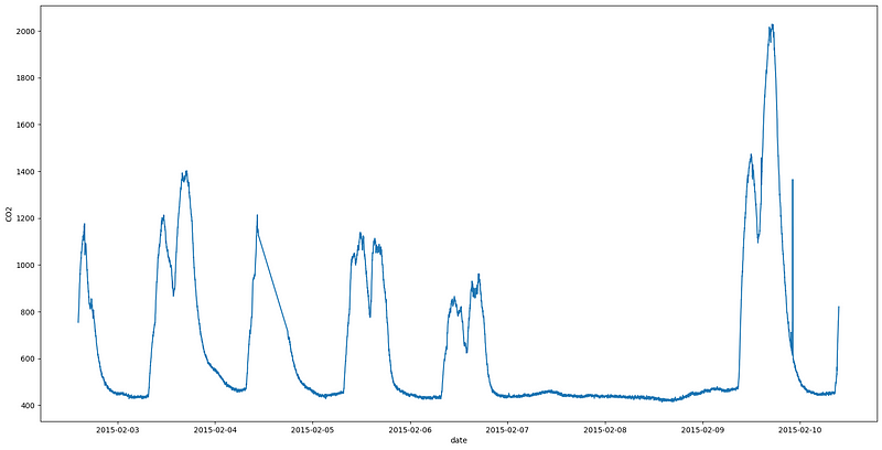
The CO2 graph also shows the spikes in the CO2 levels, which indicates the presence of a person in the room, assuming that there is no other source of CO2 in the room. In addition, the spikes correspond with the temperature graph and light graph. However, from the 7th to the 9th of February, the CO2 levels were minimal, indicating that the room was not occupied during that time. This observation contradicts the humidity graph and temperature graph.
Visualizing the Humidity Ratio Fluctuations Over Time
#lineplot for humidity ratio changes for time
plt.figure(figsize=(20,10))
sns.lineplot(x='date',y='HumidityRatio',data=df)
plt.show()
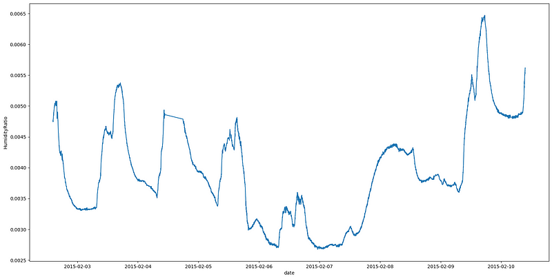
The humidity ratio graph is quite similar to the humidity graph. The spikes in the graph indicate the presence of people in the room. Moreover, the same assumption is made about the humidity ratio after the 9th of February.
Correlation Between the Variables
Correlation Heatmap
#correlation heatmap
plt.figure(figsize=(20,10))
sns.heatmap(df.corr(),annot=True)
plt.show()
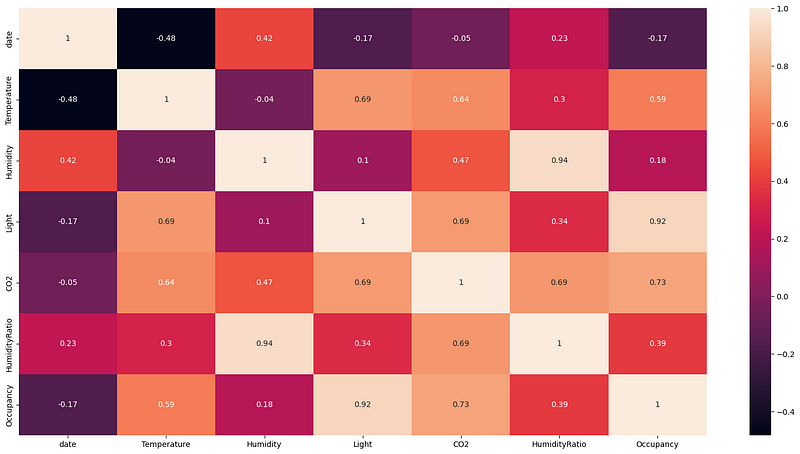
There is a strong correlation between light and occupancy as well as between humidity and humidity ratio. The CO2 levels and temperature also show a strong correlation with the occupancy. However, the humidity and humidity ratio has little correlation with the occupancy.
Temperature and Occupancy
#violinplot for temperature
sns.violinplot(y = df['Temperature'],x = df['Occupancy'])
plt.xlabel('Occupancy')
plt.ylabel('Temperature')
plt.show()
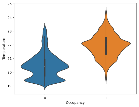
The temperature and occupancy graph shows that the room temperature increases when a person is in the room because of the heat emitted by the human body. The room’s temperature decreases when there is no person in the room. This proves the hypothesis regarding the peaks in the temperature graph.
Light and Occupancy
#boxplot for light
sns.boxplot(y = df['Light'],x = df['Occupancy'])
plt.xlabel('Occupancy')
plt.ylabel('Light')
plt.show()
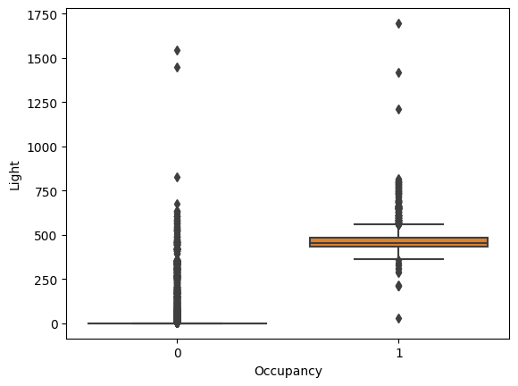
The light intensity of the room increases when there is a person in the room. This is because the lights are turned on when a person is in the room. The light intensity of the room decreases when there is no person in the room. This proves the hypothesis regarding the peaks in the light graph. The outliers in the boxplot and the curves in the light graph might be due to sunlight entering the room.
CO2 and Occupancy
#violinlot for co2
sns.violinplot(y = df['CO2'],x = df['Occupancy'])
plt.xlabel('Occupancy')
plt.ylabel('CO2')
plt.show()
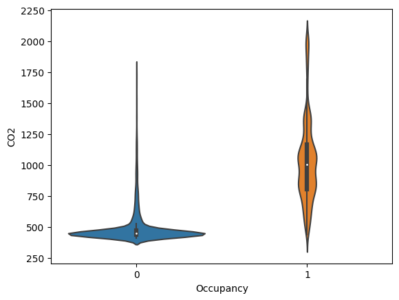
The CO2 levels of the room increase when there is a person in the room because of the CO2 emitted by the human body. The CO2 levels of the room decrease when there is no person in the room. This proves the hypothesis regarding the peaks in the CO2 graph.
From the above EDA, it is clear that the room’s temperature, light, and CO2 levels are good occupancy indicators. Therefore, we will be using these three variables for our classification model.
Data Preprocessing 2
Dropping the columns to reduce the dataset dimensionality
#dropping columns humidity, date and humidity ratio
df.drop(['Humidity','date','HumidityRatio'],axis=1,inplace=True)
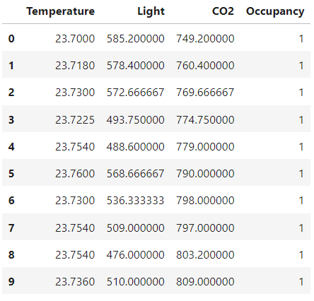
df.head(10)
Train Test Split
Splitting the dataset for training and testing the machine learning model
from sklearn.model_selection import train_test_split
x_train,x_test,y_train,y_test = train_test_split(df.drop(['Occupancy'],axis=1),df['Occupancy'],test_size=0.2,random_state=42)
Model Building
Random Tree Classifier
from sklearn.ensemble import RandomForestClassifier
rfc = RandomForestClassifier()
rfc
Training the model
#training the model
rfc.fit(x_train,y_train)
#training accuracy
rfc.score(x_train,y_train)
=> 0.96
Model Evaluation
Predicting values from the model
rfc_pred = rfc.predict(x_test)
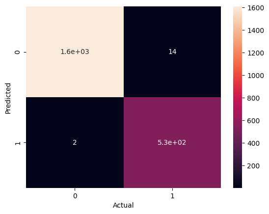
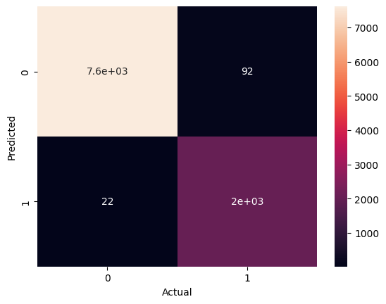
Confusion Matrix Heatmap
#confusion matrix heatmap
from sklearn.metrics import confusion_matrix
sns.heatmap(confusion_matrix(y_test,rfc_pred),annot=True)
plt.ylabel('Predicted')
plt.xlabel('Actual')
plt.show()
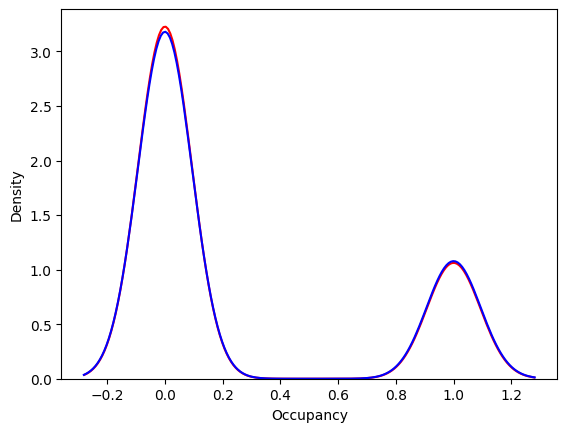
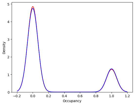
Distribution Plot
#distribution plot for the predicted and actual values
ax = sns.distplot(y_test,hist=False,label='Actual', color='r')
sns.distplot(rfc_pred,hist=False,label='Predicted',color='b',ax=ax)
plt.show()
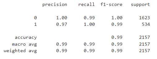
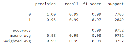
Classification Report
from sklearn.metrics import classification_report
print(classification_report(y_test,rfc_pred))
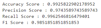
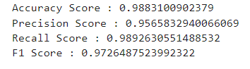
Model Metrics Evaluation
from sklearn.metrics import accuracy_score
from sklearn.metrics import precision_score
from sklearn.metrics import recall_score
from sklearn.metrics import f1_score

print('Accuracy Score : ' + str(accuracy_score(y_test,rfc_pred)))
print('Precision Score : ' + str(precision_score(y_test,rfc_pred)))
print('Recall Score : ' + str(recall_score(y_test,rfc_pred)))
print('F1 Score : ' + str(f1_score(y_test,rfc_pred)))
Testing the Model on the New Dataset
Loading the dataset
df_new = pd.read_csv('datatest2.csv')
df_new.head()
Making similar changes to the testing dataset
#dropping columns humidity, date and humidity ratio
df_new.drop(['Humidity','date','HumidityRatio'],axis=1,inplace=True)

#splitting the target variable
x = df_new.drop(['Occupancy'],axis=1)
y = df_new['Occupancy']
Predicting the values from the test dataset
#predicting the values
pred = rfc.predict(x)
Confusion Matrix Heatmap
#confusion matrix heatmap
sns.heatmap(confusion_matrix(y,pred),annot=True)
plt.ylabel('Predicted')
plt.xlabel('Actual')
plt.show()
Distribution Plot
#distribution plot for the predicted and actual values
ax = sns.distplot(y,hist=False,label='Actual', color='r')
sns.distplot(pred,hist=False,label='Predicted',color='b',ax=ax)
plt.show()
Classification Report
print(classification_report(y,pred))
Model Metrics
print('Accuracy Score : ' + str(accuracy_score(y,pred)))
print('Precision Score : ' + str(precision_score(y,pred)))
print('Recall Score : ' + str(recall_score(y,pred)))
print('F1 Score : ' + str(f1_score(y,pred)))
Conclusion
The above models show that the Random Forest Classifier has the highest accuracy score of 98%. Therefore, we will use the Random Forest Classifier for our final model. The exploratory data analysis found that the change in room temperature, CO levels, and light intensity can be used to predict the room occupancy in place of humidity and humidity ratio.
