Without solid marketing efforts companies will have a hard time growing and sustaining their business.
The marketing department of any organization is crucial for building the company’s brand and engaging customers with relevant content with the intention of increasing sales and revenue. But in order to serve their customer base best, the marketing team needs to understand them — what is it that their customers want, what do they need?
If your company is able to determine this, then you can launch a targeted marketing campaign that aims to educate and engage the customer with content that is specific and tailored to their needs. If data about your customers is available, then data science can be applied to perform market segmentation.
Imagine that you’ve been hired as a consultant for a credit card company. One of the objectives for the marketing team this quarter is to launch a targeted ad campaign. In order for marketers to launch a targeted marketing campaign, they’ll need to learn about their customers: what are their spending habits, what patterns of credit usage present themselves, and so on. Over the years, your company has collected a lot of valuable data about how their customers use their credit card products.
The marketing team wants to launch a campaign and, in order to target customers appropriately, the team wants to divide the customers into three to five distinctive segments.
In this blog, we’ll do the following activities:
• Profile our data set
• Do some light data cleaning
• Find initial segments using a clustering technique known as k-means
• Use PCA for dimensionality reduction and use k-means to find clusters on the reduced dataset.
• Experiment with autoencoders for dimensionality reduction and use k-means to find clusters on the reduced dataset.
We’ll be tracking our experiments and logging any artifacts using Comet.
The dataset we’re using for this post comes from the Kaggle Credit Card Dataset for Clustering, which you can download here.
Go ahead and open up a fresh Jupyter notebook, adjust your windows sizes according to your preference, and follow along with me.
Profiling our dataset
The dataset we’re working with summarizes credit card usage behavior for roughly 9000 active credit card holders over the previous six months. We’ve got 18 behavioral features at our disposal, which are described in the table below.

Let’s begin by downloading the dataset. Run the code below to download it to your workspace.
%pip install gdown --upgrade --quiet
import gdown
def download_from_gdrive(gid, output):
"""Download csv file from Google.
Args:
gid (str): Google Drive's file ID.
output (str): Output filename.
"""
gdown.download(id = gid, output = output)
download_from_gdrive(gid = "1LIIW7rcLExMbsC5RFG87laIL_Nn_yy8Q", output = 'cc_data.csv')
We’ll also install Comet and import it:
%pip install comet_ml --quiet
import comet_ml
from comet_ml import Experiment, Artifact
We’ll also import all the other libraries that will help us in this project:
%pip install sweetviz --quiet
import sweetviz
import pandas as pd
import numpy as np
import seaborn as sns
import pickle
import matplotlib.pyplot as plt
from numpy import save
from sklearn.preprocessing import StandardScaler, normalize
from sklearn.cluster import KMeans
from sklearn.decomposition import PCA
from sklearn.metrics import silhouette_score
from tensorflow.keras.layers import Input, Add, Dense, Activation
from tensorflow.keras.models import Model, load_model
from tensorflow.keras.initializers import glorot_uniform, lecun_normal
from tensorflow.keras.models import Sequential
from tensorflow.keras.optimizers import SGD
We can now load in our dataset and inspect it:
cc_df = pd.read_csv('cc_data.csv')
cc_df.head()
cc_df.info()
We’ll now initialize an experiment in Comet. Note that you’ll need to pass your API from Comet and change the workspace name to whatever yours is.
Typically, your workspace name is the same as the username you registered with.
You’ll need a Comet account to follow along. It’s totally free, and easy to sign up.
Once you’re up and running there, you’re going to need your API key. To obtain your API key, navigate to your Comet.ml dashboard. In the top right corner click on your username and select Settings from the dropdown menu. In the Settings page, scroll down to the Developer Information section and click “Generate API Key.”
After running the following line of code, you’ll be prompted to enter your API key.
comet_ml.login()
experiment = Experiment(workspace='team-comet-ml', project_name='cc-clustering')
We’ll now use sweetviz to perform some high level EDA and profiling of our dataset.
experiment.add_tag("sweetviz")
experiment.set_name('profiling-data')
report = sweetviz.analyze(cc_df, pairwise_analysis = 'on')
report.log_comet(experiment)
experiment.end()
By following the link in the url section and navigating to HTML on the bottom left in the panel, we can see that our profiling report was automatically saved to Comet. This allows us to easily share with our colleagues without them having to run this code themselves.
We can also view the report right here in our notebook by running the following line of code or following this link.
report.show_notebook(w=900, h=500, scale=0.8)
Some high level observations we can glean from the profiling report:
- Average balance is 1,564
- On average balance frequency is 0.88, indicating that balances are typically frequently updated
- Average purchases are 1,003, though there does seem to be a wide range of purchase prices as indicated by the standard deviation of $2,137.
- One-off purchases have an average value of $592, though there does seem to be some large one-off purchases.
I encourage you to go through the dataset on your own, exploring what seems interesting to you and seeing if you can find some interesting relationships that go beyond the surface.
Something I’d encourage you to explore are the characteristics of the customer(s) who made the largest one-off purchases and largest cash advances. It would also be interesting to bin the credit limit and examine how the spending habits of those with a higher limits differ from those of lower credit limits. When it comes to exploring this dataset, you’re only limited by your own creativity.
Since data exploration isn’t the main focus of this post, I’ll leave it up to you to uncover interesting facts and new features you could engineer. Make sure you drop a comment below to share what you’ve learned and what features you decided to engineer.
Examining the profiling report above, we can see that we have some 313 missing values for the MINIMUM_PAYMENTS feature. We also have one row where CREDIT_LIMIT is missing so we’ll simply drop this row.
I’d be interested in looking at the distribution of the credit limit for those with missing values for minimum payments. My intuition is telling me that these people will have large credit limits.
Running the following line of code, we can see a box plot of the credit limit.
cc_df[cc_df['MINIMUM_PAYMENTS'].isnull() ['CREDIT_LIMIT'].plot(kind='box')
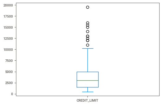
I don’t see anything too surprising here. My initial thoughts were that folks who had no value for minimum payments would have extremely large credit limits. And if that were the case then perhaps the bank would expect them to pay off the entire balance every month, kind of like with those high-end American Express cards.
Questions like this are worth exploring and trying to answer with data. I encourage you to come up with some questions of your own and leave them in the comments below, bonus points if you can link to your notebook where we can see how you performed your analysis.
At this point I’d encourage you to research missing data mechanisms and see if you can run some statistical tests to understand the missing data in our dataset.
Here’s a handy visual from The Data Professor of various imputation techniques for the different missing data mechanisms.
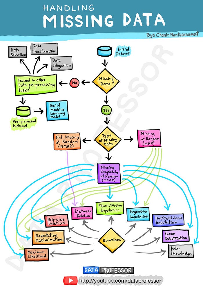
I’m going to make the assumption that our data is missing completely at random (MCAR) and impute the missing values with the median. If you’re interested in learning more about the three missing data mechanisms, then check out this post.
cc_df.loc[(cc_df['MINIMUM_PAYMENTS'].isnull() == True), 'MINIMUM_PAYMENTS'] = cc_df['MINIMUM_PAYMENTS'].median()
cc_df = cc_df[cc_df['CREDIT_LIMIT'].isnull() == False]
There’s one row in which the credit limit is missing, let’s go ahead and drop that row. We’ll also drop the CUST_ID feature as it won’t be useful in determining clusters.
Since we’ve made some significant changes to our raw dataset, we’ll go ahead and log our resulting dataset to Comet as an Artifact. This is useful because it allows us to share the modified dataset in a central location for our team to access. No more having to send files in email, Slack messages, or other such dodgy means.
Go ahead and run the following line of code in your notebook:
cc_df.drop(columns='CUST_ID', inplace=True)
cc_df.to_csv('cc_df_imputed.csv')

# Since k-means uses Euclidean distance, it would be a good to scale the data
scaler = StandardScaler()
creditcard_df_scaled = scaler.fit_transform(cc_df)
save('cc-data-scaled.npy', creditcard_df_scaled)

data_artifacts = {
'cc_df':{'df':'cc_df_imputed.csv',
'type':'data-model',
'alias':['raw-features'],
'metadata':{'filetype':'csv', 'notes':'This dataset contains median imputed values for MINIMUM_PAYMENTS'}
},
'cc_df_scaled':{'df':'cc-data-scaled.npy',
'type':'numpy-array',
'alias':['scaled-features'],
'metadata':{'filetype':'npy', 'notes':'Scaled dataset saved as numpy ndarray.'}
},
}

def artifact_logger(artifact_dict:dict, key: dict, ws:str ,exp_name:str, exp_tag:str):
"""Log the artifact to Comet
Args:
artifact_dict (dict): dictionary containing metadata for artifact
ws(str): Workspace name
key (str): The key from which to grab dictionary items
exp_name (str): Name of the experiment on Comet
exp_tag (str) : Experiment tag
"""
experiment = Experiment(workspace=ws,project_name=exp_name)
experiment.add_tag(exp_tag)
experiment.set_name('log_artifact_' + key)

artifact = Artifact(
name = key,
artifact_type = artifact_dict[key]['type'],
aliases = artifact_dict[key]['alias'],
metadata = artifact_dict[key]['metadata']
)

artifact.add(artifact_dict[key]['df'])

experiment.log_artifact(artifact)
experiment.end()

# Log training and testing sets to Comet as artifacts
for key in data_artifacts:
artifact_logger(data_artifacts,key, ws='team-comet-ml', exp_name='cc-clustering', exp_tag="imputed-data")
How we’ll use k-means to find clusters
The legendary Josh Starmer (who has also been a guest on my podcast) created an excellent overview of what k-means clustering is and how it works. I highly recommend checking it out.
The k-means algorithm is an unsupervised learning algorithm that works by grouping similar data points together. This idea of similarity is based on the Euclidean distance between points.
At a high-level the algorithm involves five steps.
First, you choose the number of clusters you wish to identify, let’s call this k. Second, you select k random points that are going to be the centroids of each cluster. Third, you assign each data point to the nearest centroid. This will allow you to create k clusters. Fourth, you calculate a new centroid for each cluster. Fifth, you reassign each data point to the closest cluster.
In our case we know that the marketing department wants to identify between three and five clusters, but what if you didn’t know how many clusters you were looking for beforehand?
Then you’d want to use a technique called the elbow method. We won’t discuss that in detail in this post, but you can learn more about it here.
So, how can you tell if your clusters are good?
There are two qualities that indicate whether your method of clustering is of high quality. First, you’ll observe “high intra-class similarity.” This means that the average squared distance of all the points within a cluster to its centroid is minimized (within clusters sum of squares, which is also captured by the inertia_ attribute of the kmeans model). Second, you’ll observe “low inter-class similarity.” This means that the average squared distance between the centroids is maximized (between clusters sum of squares).
One metric we can use to capture how good our clusters are is the silhouette score. This score allows us to quantify how well samples are clustered with other samples that are similar to each other.
According to the scikit-learn documentation:
The Silhouette Coefficient is calculated using the mean intra-cluster distance (
a) and the mean nearest-cluster distance (b) for each sample.The Silhouette Coefficient for a sample is
(b - a) / max(a, b). To clarify, >bis the distance between a sample and the nearest cluster that the sample is not a part of.The best value is 1 and the worst value is -1.
Values near 0 indicate overlapping clusters. Negative values generally indicate that a sample has been assigned to the wrong cluster, as a different cluster is more similar.
What we’ll do from here is use k-means on the full dataset to find three, four, and five clusters (we can consider this as our baseline methodology). Then we’ll save the results to Comet.
After that we’ll apply PCA to our dataset to find the top two principal components (to make it easier to visualize) and use k-means to find three, four, and five clusters.
Finally, we’ll use an autoencoder network to perform dimensionality reduction down to two features and then use k-means to find three, four, and five clusters.
The methodology which results in the best silhouette score (as close to 1 as possible) will be our chosen method. We can then use some descriptive statistics to try to understand the customer behavior for those clusters.
The following function defines how we will find clusters:
def find_clusters(df:pd.DataFrame, file:str):
"""
Run an experiment to find 3, 4, and 5 clusters.
Parameters:
df: The dataframe on which clustering will take place
file: A string to help add tags, and identifying information for the experiment
"""
for k in range(3,6,1):
file_string = file + "_" + str(k)
experiment = Experiment(workspace='team-comet-ml', project_name='cc-clustering')
experiment.add_tag(file + "_" + str(k) + "_clusters")

kmeans = KMeans(k, random_state=42, algorithm='elkan', n_init = 100)
pickle.dump(kmeans, open(file_string + ".pkl", "wb"))
kmeans.fit(df)
labels = kmeans.labels_
clusters = pd.DataFrame(labels, columns = ["cluster_label"])
cc_df_clusters=pd.concat([cc_df, clusters], axis=1)
cc_df_clusters.to_csv(f'cc_df_{k}_clusters.csv')
score = silhouette_score(df, labels, metric='euclidean')
metrics = {"silhouette_score": score, "inertia": kmeans.inertia_}

experiment.log_model(file_string, file_string + ".pkl")
experiment.log_parameters(k)
experiment.log_metrics(metrics)
experiment.log_table(f'cc_df_{k}_clusters.csv', tabular_data=True, headers=True)
experiment.end()
Clicking into each individual experiment, for example this one, we can see all that we’ve logged to Comet.
Comet automatically tracks all of our hyperparameters for us. In addition to that, we’ve logged our silhouette score metric. If you look at the last panel, Assets and Artifacts, you’ll see that we’ve saved the resulting k-means model and a csv file which has our cluster definitions appended to the raw data.
Using autoencoders to find clusters
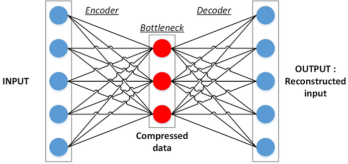
An autoeconder is a type of neural network that is used for feature learning (representation learning).
At a high level, here’s how they work: an autoencoder network takes an input, breaks it down to a compressed version, and uses that to reconstruct the original input. An interesting feature of these networks is that they use the same input data for both input and output. These networks work by adding a bottleneck layer which forces the network to create a compressed (or encoded) version of the original input data. The hope is the bottleneck layer is able to encode useful characteristics of the original data in some compressed format. This works much like principal component analysis in that we can take a higher dimension feature space and reduce the data our data to a lower dimension latent space.
For more detail on how autoencoders work, I recommend this easy to understand video from WelcomeAIOverlords on YouTube.
We’ll experiment with one autoencoder architecture and track our experimental runs to Comet.
How to train autoencoders
You need to set four hyperparameters before training an autoencoder:
Bottleneck size
The bottleneck size, which is the last layer in the encoder, is the most important hyperparameter used to tune the autoencoder.
This determines the number of features that the autoencoder will be compressed into, and can serve as a regularization term.
Number of layers
As with every neural network out there, an important hyperparameter for autoencoders is the depth of the encoder network and depth of the decoder network.
Deeper networks will increases model complexity and time to train, while a shallower network will be faster to train.
Number of nodes per layer
The number of nodes per layer defines the weights we use per layer.
Typically, the number of nodes decreases with each subsequent layer in the autoencoder as the input to each of these layers becomes smaller across the layers.
Loss
The loss function you use to train the autoencoder will depend on the type of input and output you want the autoencoder to learn a representation for.
Since we’re working with tabular data, the most popular loss functions for reconstruction are MSE Loss and L1 Loss.
Encoder
Let’s define the encoder part of the model, which compresses input data into an encoded representation that will be fewer features than the original data.
It takes an array of size 17 (because that’s how many features our full dataset has) as input and passes it through a multi-layer dense network. The final layer of the encoder has only two neurons, this layer is expected to represent each given example with two float numbers. We’ll use the selu activation function with the lecun_normal kernel initializer.
The final layer in the encoder network is the “bottleneck” layer that will contain the compressed representation of our full feature. This is the absolute most important part of this network.
Note that this is a point where you can experiment.
I encourage you to play around with this code and try different number of layers, different number of neurons in each layer, different activation functions and different kernal initializers.
When you play around with the code and log your experiment to Comet, you won’t have to remember all the details yourself.
You simply build out the network, take the resulting dataset, use the find_clusters function to find clusters, and log results to Comet.
encoder_network = Sequential(
[
Dense(17, activation="selu", kernel_initializer = 'lecun_normal'),
Dense(8, activation="selu", kernel_initializer = 'lecun_normal'),
Dense(4, activation="selu", kernel_initializer = 'lecun_normal'),
Dense(2, activation="selu", kernel_initializer = 'lecun_normal'),
]
)
Decoder
The decoder part of the autoencoder network is typically a mirror image of the encoder model.
The decoder takes the reduced feature space as its input and reconstructs the original features by expanding the dimensions out to the original number of inputs. It essentially decompresses the information that was captured with the encoded data. The end result in this case will be an array of dimension 17 as output. This output array is expected to be similar to the input array.
Just like the encoder part of the network, I encourage you to try different values for the various hyperparameters.
decoder_network = Sequential(
[
Dense(2, activation="selu", kernel_initializer = 'lecun_normal'),
Dense(4, activation="selu", kernel_initializer = 'lecun_normal'),
Dense(8, activation="selu", kernel_initializer = 'lecun_normal'),
Dense(17, activation="selu", kernel_initializer = 'lecun_normal'),
]
)
We can go ahead and log this experiment to Comet with the following code:
experiment = Experiment(workspace='team-comet-ml', project_name='cc-clustering')
experiment.add_tag("autoencoder")

autoencoder_network = Sequential([encoder_network, decoder_network])
autoencoder_network.compile(optimizer= 'adam', loss='mean_squared_error')
autoencoder_network.fit(creditcard_df_scaled, creditcard_df_scaled, batch_size = 128, epochs = 150,  verbose = 0)

pred_df = pd.DataFrame(encoder_network.predict(creditcard_df_scaled), columns=['encoding1', 'encoding2'])
pred_df.to_csv('encoded_df.csv')

autoencoder_network.save_weights('autoencoder.h5')
experiment.log_model("autoencoder", "autoencoder.h5")

experiment.log_table("encoded_df.csv", tabular_data=True, headers=True)
experiment.end()
Examining the output from our experimental runs, we can see that the best (value closest to 1) for silhouette score is 0.61, which is achieved using the autoencoder with three clusters.
As a starting point for understanding our clusters, we can examine the average values for all the features we have, which we can then pass along to the marketing team for further analysis.
cc_df_3_clusters.groupby('cluster_label').agg('mean')
That’s all there is to it!
You’ve done a lot in this mini lesson, let’s recap:
- Performed some automated data exploration and light data cleaning.
- Built a baseline clustering models using the k-means algorithm with the full feature set.
- Used PCA to reduce the number of dimensions to two and applied k-means clustering to the resulting dataset.
- Built an autoencoder network to perform dimensionality reduction and applied k-means to find clusters.
- Determined that using the autoencoder network with three clusters resulted in the best silhouette score.
Go ahead and play around with the code examples here, build a different network with differing layers, try various activation functions and kernel initializers, try finding more clusters, or perform some feature engineering or feature selection.
I’m excited to see what you come up with, so be sure to share your results in the comments!
