
The way developers interact with products is changing, and opening your app’s dashboard is no longer the obvious entry point. They want to use their apps inside the terminal. Why? Because they’re already there.
We’re seeing more users instrumenting MCP and it makes sense. As engineers work primarily in their terminals, they want to treat it almost like a cockpit – start there rather than go somewhere else to gather information and jump back. The UX of today’s product needs to be fluid between platforms, and we can’t rely on our own UI to carry the whole experience.
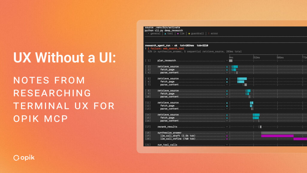
This matters more for us than for most. Opik is an open-source LLM observability and evaluation platform built by Comet, and it’s meant to be used with agents. Our users are AI builders; they are evaluating agents, debugging agents, and increasingly doing all of that with an agent sitting in their terminal. If your product exists to help people work with agents, it’s a strange position to insist they leave the place where the agents are.
Recently I spent a day working out how we could bring our UI into the terminal. Here’s how I went about it. I used a coding agent to create a renderer that turns trace data from our app into a text chart – a waterfall representation of a trace – similar to the view we display in the app, but this time in the terminal.
I generated 10 traces with deliberately varied shapes (some healthy, but also one with a latency spike, one with a retry storm, and one with a cascading failure). I tested it two ways — as a / command the user types, and as a tool the LLM calls during the session.
The terminal isn’t a screen. It’s a page.
I remember when I was first starting in UX, one of my mentors said that websites initially were inspired by newspapers. And funny enough, I feel like we came a full cycle. A tool result in the terminal is not really UI. It is a static block of text. There’s no interaction and no persistent point of reference. It scrolls away and that’s it.
So the closer analogy is print. We create hierarchy through spacing and alignment, not depth. This is particularly challenging for data heavy screens as we can’t rely on progressive disclosure. Each impression has to be its own complete thing.
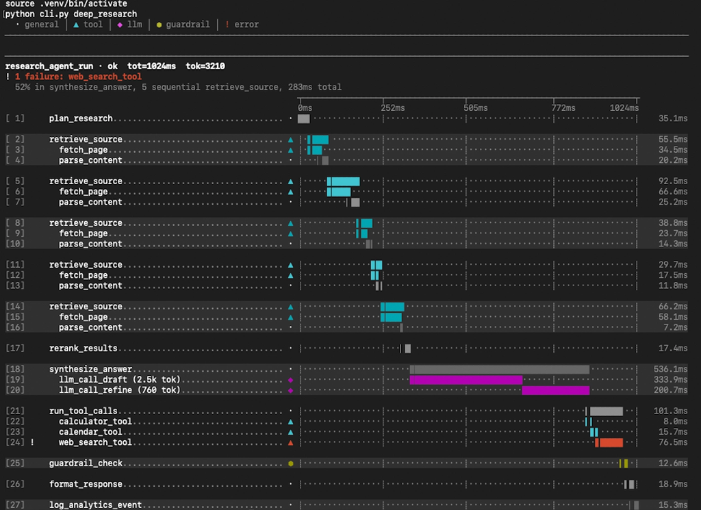
What does it all mean for design? Here is what I’ve learned:
1. You can’t guarantee your design appears
When I ran the renderer directly it worked like a charm every time. But when the path broke and the LLM ran the command itself to recover, it didn’t show the chart at all. It wrote a summary instead.
And when you think about it, it makes total sense. AI is not a deterministic system so we can’t be sure of the output. Based on user input it’s the LLM that decides what to do with it – show the chart, call a tool, summarize, reformat. As a designer you have no way of ensuring this.
2. You can’t use adaptive or responsive tactics
A tool called by an agent has no way of knowing how wide your terminal is. Mine was 222 columns. The tool defaulted to 80 and truncated names for no reason.
Guess too wide and every row wraps mid-chart and looks like the data is broken. Guess too narrow and you waste space. Wrapping destroys the chart, clipping costs you space.
3. Nothing is clickable
Remember all those cute explainers and pop-overs used for data dense screens? Forget it. You can’t use hover, clicks, expand. Think about a trace with 200 spans (which by the way could get much bigger). You also have maybe 40 rows available and you can’t use a scrollbar. So the design challenge is actually editorial: if a trace has 200 spans, which 20 matter, and how do you show that you cut the rest?
4. Color might not survive
When I ran the command directly the colors worked well. But when the coding agent called the tool, the chart arrived as literal escape-code text. The model described the colors to me in words rather than rendering them. So you have to design monochrome-first and treat color as enhancement.
Bonus tip: keep the terminal theme. So use named ANSI colors rather than hex (say “cyan,” not #00B8D4). Named colors adapt to whatever theme the user has chosen.
5. Nothing persists
You may know this UX rule – wherever users land in the app, they should know where they are, where they can go, and how to get back. This doesn’t work in the terminal. There’s no URL, no return path, no navigation. The render can’t be linked, revisited, shared. It exists once, in the scrollback, and that’s it.
This means whatever you render has to be self-sufficient, and it has to be easy to keep working with. One thing I tried to make the chart usable was numbering every span, so user can refer to “row 14” instead of copying a name or writing anything down.
6. One of your users isn’t human
You’re designing for two users at once. Your tool’s response is consumed not only by the human looking at the output but also by the LLM deciding what to say about it. And they are not aligned in what they need – the human wants something visual and easy to comprehend, the model wants raw structured data.
When I gave the model my chart (or rather a text formatted as chart, we’re in a terminal) it
had to decode meaning from bar positions and lengths, the same way an eye does. This means imprecision. Investigating the chart, it incorrectly told me two steps “don’t overlap.” But looking at the raw numbers, it gave me precise answer” one ends at 671.6ms and the next starts at 672.6ms”.
For an agent-first product this is the part I keep coming back to. We already think hard about what our data means to a developer. We’ve barely started thinking about what it means to the agent interpreting it
Rules I’d start with next time
- If you have to be sure that the chart appears, don’t let the LLM run it. Let the model see the output as context, not as its responsibility.
- For visuals, design monochrome-first. Color is a bonus but will not always work.
- Never hard-code a total width. Derive it, so one changed column doesn’t break alignment.
- Clipping needs two rules. Cutting a bar loses the tip and keeps the shape. Cutting a sentence destroys it.
- Make it easy to refer to your rendered chart. Think annotating a printed page. Make sure a render is a complete story.
- Remember you’re not designing for humans only. Things like tool’s description are becoming more important – it’ the only thing deciding whether the model reaches for your tool at all.
The cockpit problem
I wanted to make the terminal a powerful cockpit. The surface can only give me a printed readout.
A cockpit is glanceable, live, continuously instrumented. A tool result is static, one-shot, and scrolls away. The aspiration and the medium are genuinely mismatched right now but that gap is where the interesting problems are.
We could try to push users towards using coding apps and create MCP App instead. I’d rather meet them where they already are – especially when the whole premise of what we’re building is that agents are where the work is happening.
And the biggest surprise for me was this: the visual design was the easiest part. The chart went from unreadable to good in a few hours. Getting it reliably in front of a person took far longer and broke in far more ways – stale sessions, path assumptions, expired auth, messages swallowed into commands…
The real work is not in good visuals. It’s reliability.