How to Integrate Seaborn and Matplotlib in Comet

Comet is an experimentation platform that allows you to keep track of your machine learning experiment. Another intriguing fact about Comet is that we can use it to perform exploratory data analysis. Comet integrates with popular Python visualization libraries which can help us achieve our EDA goals.
We will learn how to integrate Seaborn and Matplotlib with Comet in this tutorial. We will accomplish this by running some EDA on an online e-commerce dataset and logging the visualization to the Comet experimentation website or platform. Without further ado let’s get started.
So, to begin our journey, we must ensure that the following libraries are present on our machines:
- Pandas Library
- Seaborn and Matplotlib Libraries
- The comet_ml library.
If you don’t have the Comet library installed on your machine you can do that by typing the following command on your command prompt.
pip install comet_ml
— or —
conda install -c comet_ml
Now that those libraries have been put in place. The next thing will be to obtain the dataset. So the dataset I will be using in this tutorial is from UCL and can be downloaded here. This is a dataset that contains information about transactions that occurred in an online retail store in the United Kingdom between December 1, 2009, and December 9, 2011.
Loading Dataset
Let’s import the necessary libraries and load the dataset into a DataFrame.
import pandas as pd
import seaborn as sns
import matplotlib.pyplot as plt

df = pd.read_excel("online_retail_II.xlsx")

df.head()

Exploratory Data Analysis (EDA)
After you’ve loaded your data into a dataframe. The next step will be to perform exploratory data analysis on it.
EDA is essential because it provides insight into the nature of your data. You will gain all of the necessary insights from your data using EDA. EDA informs you if your data is missing or if there are any inconsistent values in your data so that you can process it later. We’ll do some EDA in this tutorial to make sure the article isn’t too bogus.
Let us now look at the countries that purchased the most from the store during the time period. We’ll take a look at the top 10 and visualize the information. In this part, we will be using Matplotlib.
mask_df = df["Country"].value_counts().head(10)
fig1 = plt.figure(figsize=(12, 10))
plt.bar(x = mask_df.index, height=mask_df, color="sienna")
plt.xlabel("Country")
plt.ylabel("Counts")
plt.title("Numbers of Orders from Countries Over the Years")
plt.xticks(rotation=45);

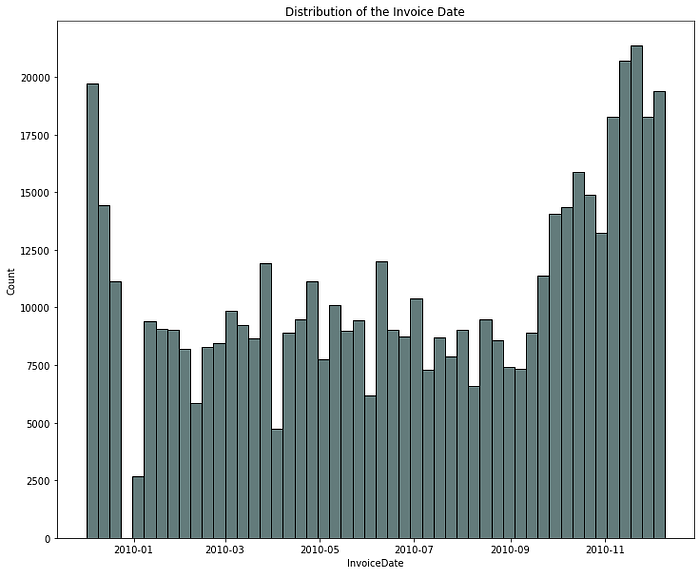
The next EDA we might want to look at is which months had the highest number of sales over the years. To achieve this we can do so by looking at the distribution of the Invoice date column.
fig2 = plt.figure(figsize=(12, 10))
sns.histplot(df["InvoiceDate"], color="darkslategrey", bins=50)
plt.title("Distribution of the Invoice Date");

Logging the Viz to the Comet Platform
After we’ve completed our visualization, the next thing will be to log the visualization to the Comet platform. In this tutorial, we will create a new project using Comet’s experiment library.
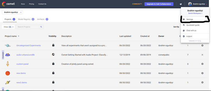
To proceed with this phase, you will need an API key from Comet. If you haven’t already signed up for their platform, click here to do so. You can find your API key by clicking on your profile picture, then going to the settings icon, and finally scrolling down, as shown below.

Once that’s done we can now create our experiment and log the visualization. To achieve that we can do that by typing this whole code.
# import comet-ml at the top of your file
from comet_ml import Experiment

# Create an experiment with your api key
experiment = Experiment(
 api_key="YOUR API KEY XXXX",
 project_name="Matplotlib Demo",
 workspace="ibrahim-ogunbiyi",
)

experiment.log_figure(figure_name="Matplotlib Viz", figure=fig1)
experiment.log_figure(figure_name= "Seaborn Viz", figure=fig2)
Want to try Comet for yourself? Try for free today!
Now let’s go over the following code in chunks:
# import comet-ml at the top of your file
from comet_ml import Experiment

# Create an experiment with your api key
experiment = Experiment(
 api_key="YOUR API KEY XXXX",
 project_name="Matplotlib Demo",
 workspace="ibrahim-ogunbiyi",
)
In the above code, we imported the Experiment library from comet_ml . Now we then instantiated it and then assign it to a variable called experiment. The Experiment library requires some parameters which are your API key, what you wish to name your project, and the name of your workspace. The workspace name can be found from the Comet platform such as:

experiment.log_figure(figure_name="Matplotlib Viz", figure=fig1)
experiment.log_figure(figure_name= "Seaborn Viz", figure=fig2)
experiment.end()
The above two lines of code are used to log our visualization to the Comet Platform. The .log_figure() methods are used for Matplotlib and Seaborn Visualization. We then name our visualization.
Remember that we’ve assigned a variable name to our visualization previously which are fig1 and fig2 we then pass it to the figure parameter.
If you are making use of a notebook, either Jupyter or Colab, then you need to end your experiment by typing the experiment.end() code.
Now we can go to our website and view our experiments:
Conclusion
In this article, we’ve learned how we can integrate Matplotlib and Seaborn with Comet. Comet provides integration with most Python libraries you can think of in Data Science and Machine learning. You can click here to check more on their documentation. The full code used in this tutorial can be found here.


