Scatter Chart
A scatter chart visualizes data points as individual dots on a coordinate grid, allowing for the examination of relationships and patterns between variables.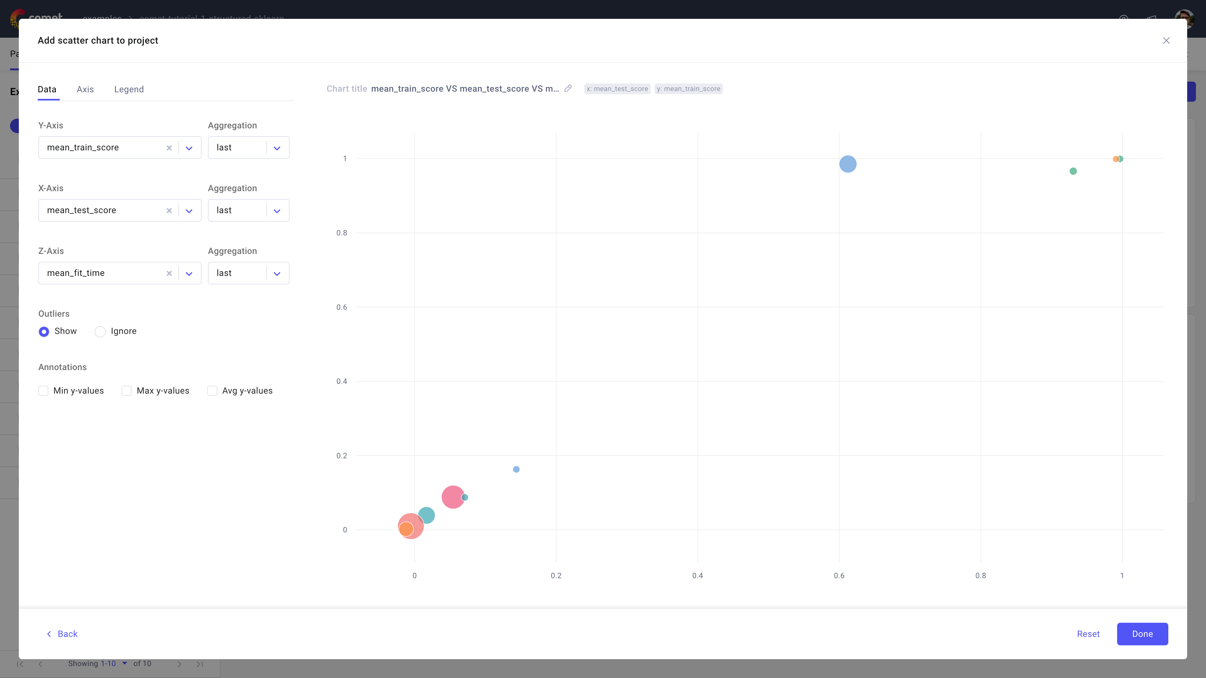
Use the scatter chart in Comet to visualize a metric or parameter (the Y axis) against (the X axis) another metric or parameter, and (through the Z axis) allow for scatter plot sizing.
Note
The value in the Z axis usually corresponds to the size of the dots in the diagram, rather than their placement.
About the Configuration Sidebar
The Configuration sidebar consists of three tabs:
Data: Select what to display in each axis.
[Y axis, X axis, Z axis]: Define the experiment attribute to use for each axis, including which transformations to perform on it.
Supported aggregations are: count, sum, avg, median, mode, rms, stddev, Min value, Max value, first, and last [default is last].
Outliers: Decide whether to show or ignore outliers.
Annotations: Define an optional line to plot across the scatter dots based on min y-values, max y-values, and/or *avg y-value*s.
Axis: Define min and max value for either or both X and Y axis.
Legend: Decide whether or not to display up to 3 legend keys in the chart.
The selected legend keys are appended in order and separated via a "-".
By default, the panel does not display the legend and suggests using the experiment name only.