Scalar Chart
A scalar chart display single numeric values, providing insights into individual metrics or measurements.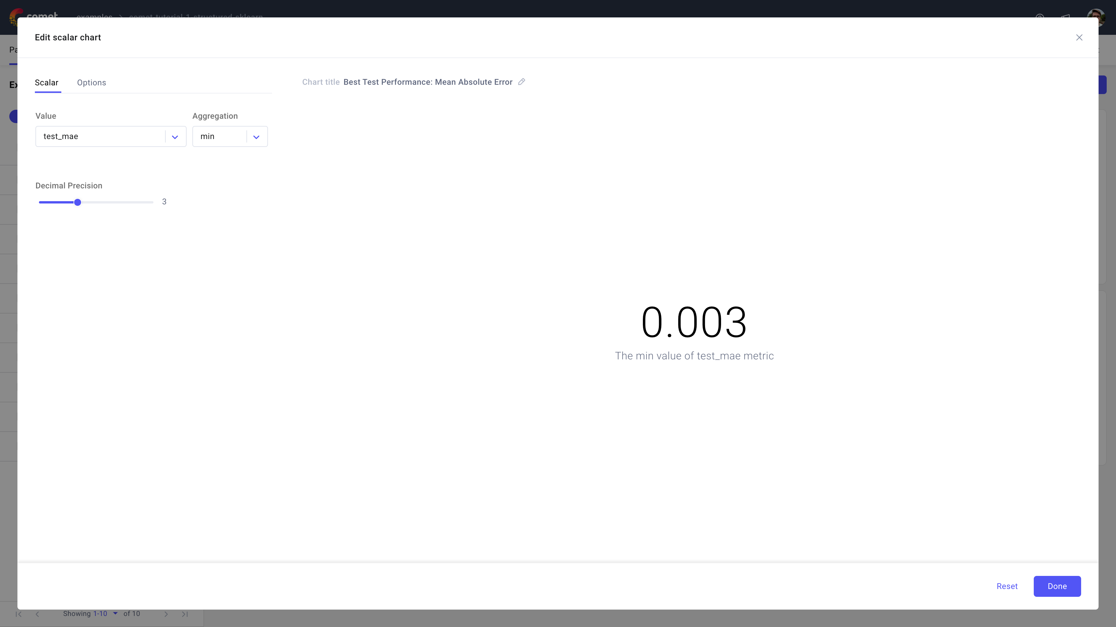
Use the scalar chart in Comet to view any numeric value or aggregation of values that is part of your experiment. The aggregated values update as new data is made available, so you can always benchmark your performance.
On the **Experiment* level*, the aggregations are calculated on the time series you recorded for that Experiment. For example, the accuracy at each step will be used to calculate the max accuracy, or average loss.
On the **Project* level*, the aggregations are calculated on the joined time series across all the Experiments. For example, the average accuracy is calculated by joining the accuracy values from all Experiments and averaging all of them.
About the Configuration Sidebar
The Configuration sidebar consists of two tabs:
Scalar: Select the variable to display in the panel.
Supported aggregations are: count, sum, avg, median, mode, rms, stddev, min, max, first, and last [default is count].
You can also select the Decimal Precision for the displayed metric as a value in [0, 9].
Options: Provide a description for the scalar value.
The description is displayed below the metric value in the panel.
About the Panel Preview
The panel displays the scalar metric with the configured decimal precision, and optional description.
Additionally, the aggregated scalar metric is hyperlinked to the experiment where the value was taken from, e.g., if the aggregation is min than clicking on the scalar metric will direct to the experiment which achieved the minimum value for the metric.