Parallel Coordinates Chart
A parallel coordinates chart represents multivariate data points as interconnected lines across multiple axes, aiding in identifying patterns and correlations among variables.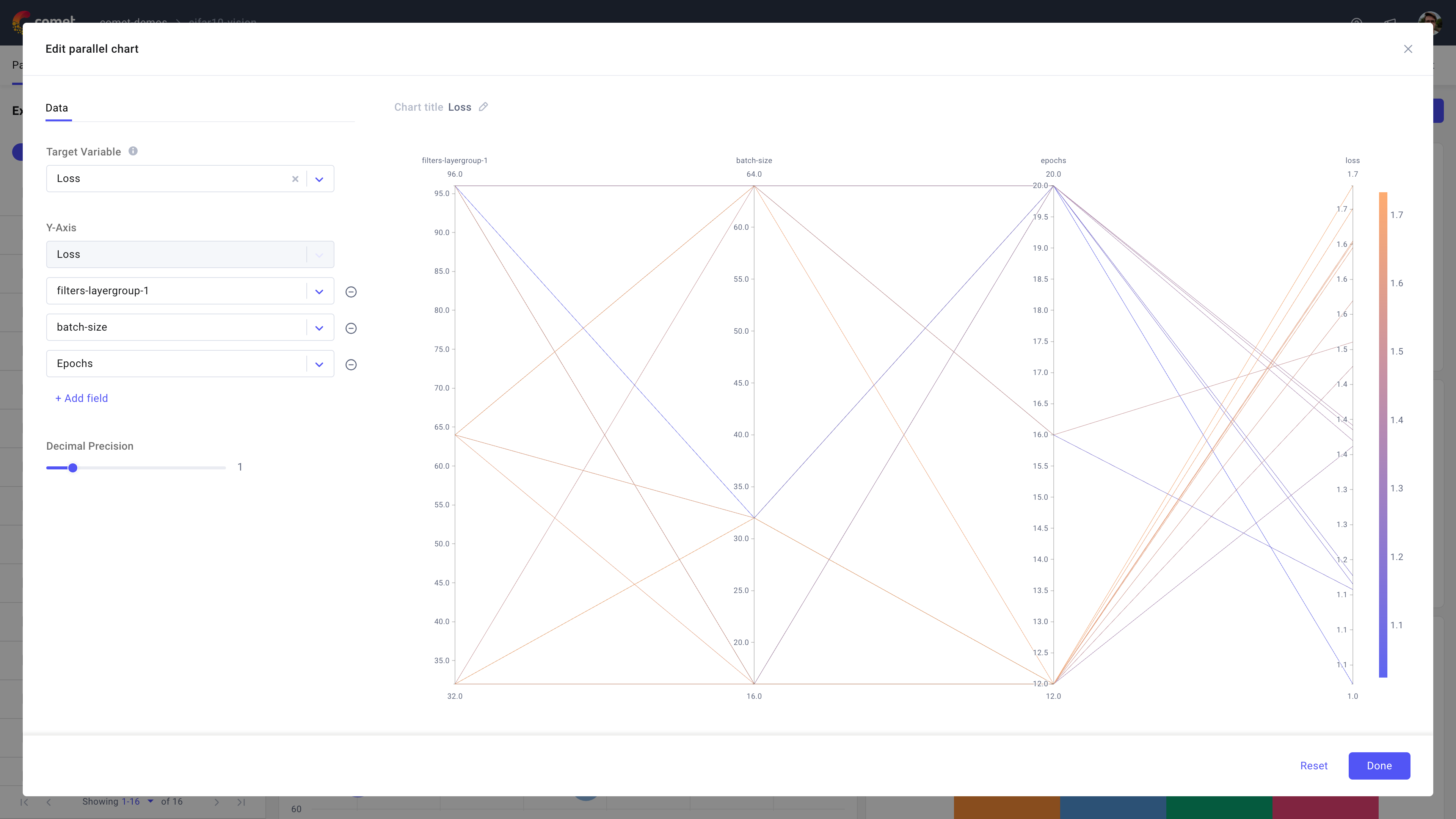
Use the parallel coordinates chart in Comet to select a target variable, typically the loss or accuracy of your model and visualize how a series of other metrics or parameters influence it across experiments.
About the Configuration Sidebar
The Configuration sidebar consists of one tab:
Data: Select what to display in each Y axis of the panel.
Target Variable: Select your main metric of interest.
The lines in the plot are colored depending on the target variable values (with corresponding temperature), so that the viewer can differentiate better performing experiments by looking at their color without tracking to the Target Variable axis.
Y-Axis: Select one or more metrics or parameters to evaluate the target variable against.
Note that the selected Target Variable is automatically pinned as a Y-Axis variable, and displayed to the furthest right of the chart.
Decimal Precision: Determine the rounding precision (in [0, 9]) for the values of the target variable and other Y-Axis variables.