Visualizations: Overview
Introduction
Visualizations in Comet are defined as panels.
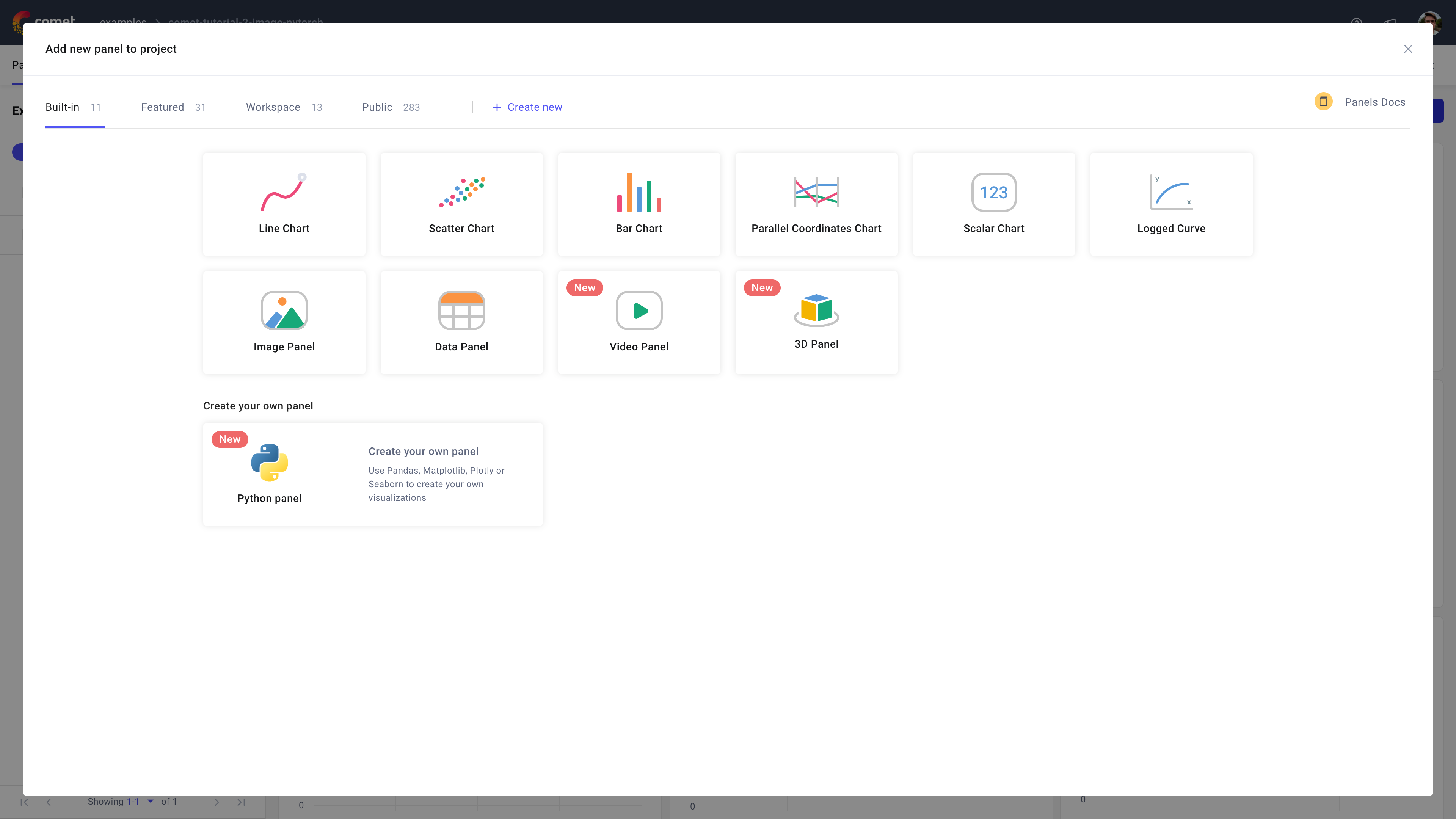
Comet supports a diverse range of panels, organized into the following categories:
- Built-in: Comet's collection of essential panels: bar chart, data panel, image panel, line chart, logged curve, parallel coordinates chart, scalar chart, scatter chart, video panel, and 3D panel.
- Featured: Comet's selection of 30+ of the most popular community panels.
- Workspace: Private collection of custom Python panels created by users in the workspace.
- Public: Public collection of almost 300 community panels.
Using Comet's panels you can create visualizations, tools, reports, exporters, and more.
Choose a panel
The first step when wanting to add a panel to a project or experiment dashboard in Comet is to understand which panel best serves your visualization requirements.
To navigate the available panel source, you can use the search functionalities of the Panels Gallery. The search filters panels based on word matches in the title and description of any panel in the selected category.
Always start by exploring the Built-in category first. Detailed information about each panel can be found on the corresponding documentation pages in the Visualizations section.
If a built-in panel does not exist that meets your visualization criteria, your next step is to explore the Featured and Public panels. The Preview functionality (accessible by clicking on the first icon to the left in any highlighted panel box) can be useful here to access examples and a more detailed description for any selected community panel.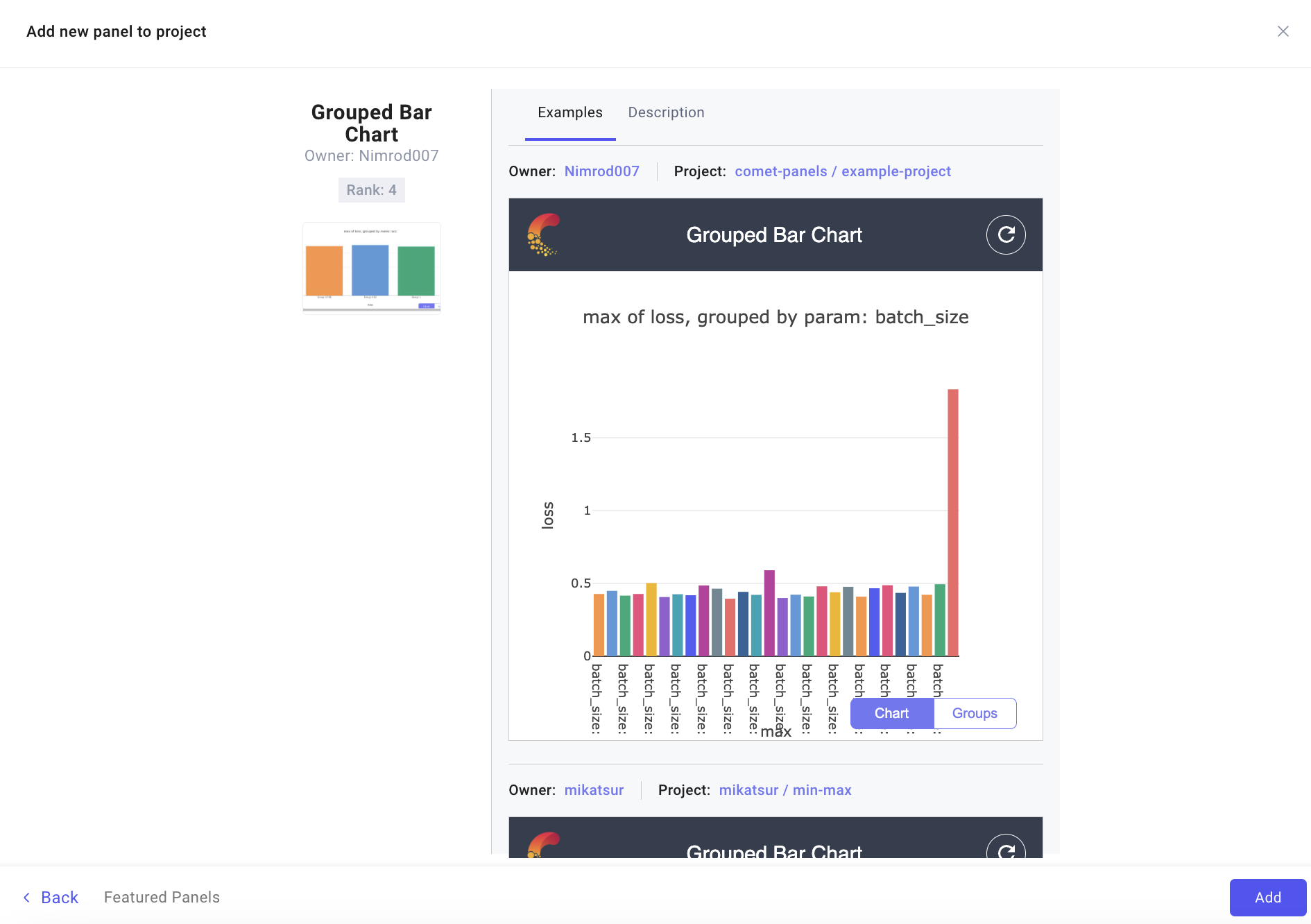
Additionally, if none of the cataloged panels meet your visualization requirements, Comet offers the option to create custom Python panels by choosing the Python Panel option in the Built-in category.
Configure a panel
After choosing a panel from the Panel Gallery, the Panel Editor displays that allows you to configure the panel.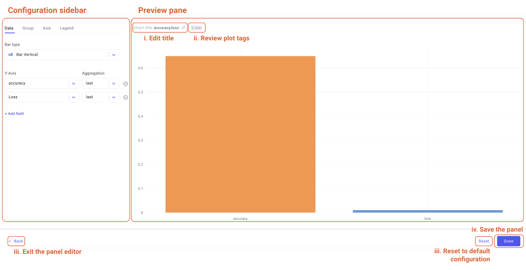
The Panel Editor is composed of two main components:
- Configuration sidebar: Used to configure the panel and it's look largely varies across panels to match the exact configuration offered by the specific visualization type.
Preview pane: Interactive displays the plot given the current configuration, and further allows you to:
- Update the chart title.
Interact with the plot:
- Via mouse over: To display the experiment name or key of the associated example.
- By zooming in via click-and-drag: To enlarge the selected area, useful to better analyze its details. You can then double-click the panel to reset the visualization to the original area.
For built-in panels only:
- Access plot tags to quickly review relevant chart configurations.
- For community panels only:
- Edit the underlying code to customize the panel.
- Define the chart as static, i.e. no refresh.
From the bottom navigation bar of the Panel Editor, you can then decide to exit the editor, reset the panel configuration to its default values, or save the panel.
Note
The Panel Editor has a different layout for the custom Python panel type. Please refer to the Python Panel page for more details.