Bar Chart
A bar chart represents the (frequency of) values for a variable using bars of varying widths or heights, useful to compare values in subcategories when ranking is meaningful.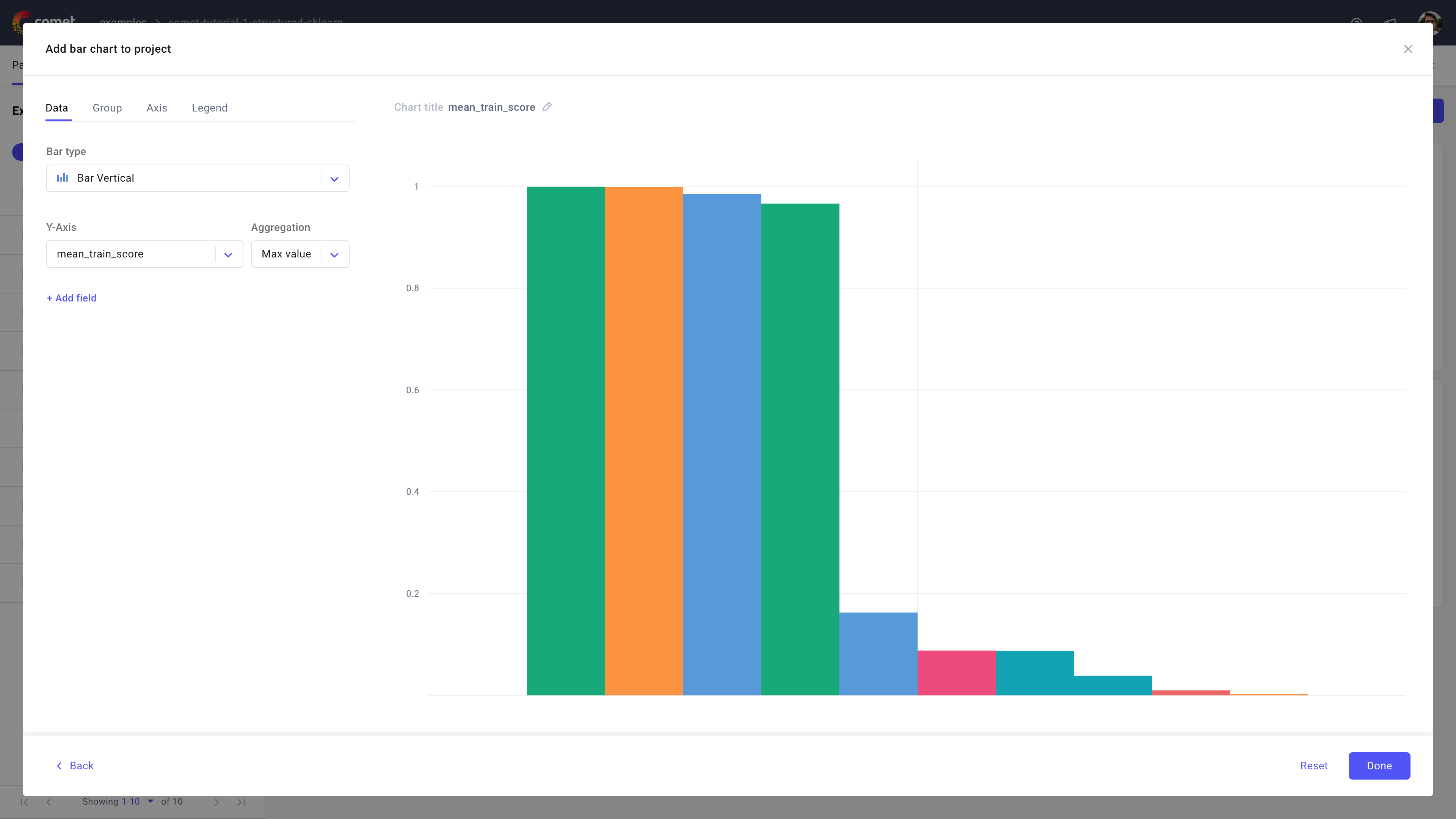
Use the bar chart in Comet to visualize multiple metrics' aggregation against (the X axis) experiments.
About the Configuration Sidebar
The Configuration sidebar consists of four tabs:
Data: Select what to display in each axis and the type of bar chart to create.
Bar type: Choose the type of bar chart to plot: first, decide between vertical or horizontal bars; then, select between classic, box, stacked bar, or violin.
Y-Axis: Define one or more experiment variables to display.
If more than one field is selected, the plots will be displayed side-by-side per experiment variable selected.
Supported aggregations are: count, sum, avg, median, mode, rms, stddev, Min value, Max value, first, and last [default is last].
Group: Decide whether to group the selected experiment variables by a supported experiment variable.
Given the selected group by variable, the Grouping aggregation selector will display supported aggregations (such as mean, min, max, etc.).
Note that all selected Y-axis fields will undergo the group by.
Axis: Define min and max value for either or both X and Y axis.
Legend: Decide whether or not to display up to 3 legend keys in the chart.
The selected legend keys are appended in order and separated via a "-".
By default, the panel does not display the legend and suggests using the experiment name only.
About the Panel Preview
The panel allows you to interactively analyze each bar in the plot.
When hovering on a bar, the panel puts the selected bar on focus and displays the associated experiment name, y value, and any other selected legend keys.